Two postcards “Art” both undivided back – one faux divided back

August 27, 2015

08/27/2015

In memoriam, Kathleen Evans, artist

Here are two instances of the same postcard titled “Art”.  Both are undivided back postcards, number 118 (front lower left) and COPYRIGHT 1906 S. S. PORTER, CHICAGO (front lower right), with ANGLO SERIES PUBLISHED BY A. H. printed along the back left edge.

Being printed in 1906, at a time when a message on the back of the post card was prohibited, and only the address was allowed to be written on the back of the postcard (commonly referred to as the undivided-back postcard era or UDB postcard era), these postcards were printed without a vertical line in the center of the back of the card.

Here are the front and back images of the unused “Art” postcard:

Art_0_UDB_obverse

FRONT OF UNUSED UDB “Art” POSTCARD

Art_0_UDB_reverse

BACK OF UNUSED UDB “Art” POSTCARD

Now, here are the front and back of the “Art” postcard that was postmarked on October 8, 1907:

Art_1_FAUX_DB_obverse

FRONT OF USED FAUX-DB “Art” POSTCARD

Art_1_FAUX_DB_reverse

BACK OF USED FAUX-DB “Art” POSTCARD

At first glance, the second “Art” postcard appears to be  a divided-back postcard, but it is, in fact, the same undivided-back “Art” postcard as shown in the unused copy of “Art”.  Effective March 1, 1907, the U. S. Post Office allowed the left side of the back of a postcard to contain a message, with the right side of the postcard reserved for the name and address of the addressee.  The sender of this postcard, one  “M. E. G.”, took advantage of that fact, and created a vertical line with the fountain pen being used to pen the written message.  It took quite a while for people to get used to writing a message on the back of a postcard, even though allowed to, and even though the postcard might have been printed with the vertical divider line on the back.  So I give M. E. G. credit for being bold enough to create her own (for some reason I think that M. E. G. is a female) divided-back postcard, just seven months after the postal regulations were changed.

Bicentennial of the Battle of Lake Erie – Commodore Oliver Hazard Perry’s Victory

August 28, 2013

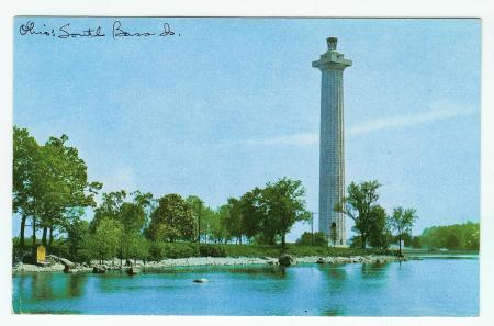
There is much activity around South Bass Island and the village of Put-in-Bay over Labor Day weekend, 2013, since celebrations, re-enactments, tall ships, music and more are planned 08/29/2013 through 09/10/2013.  The latter date is the bicentennial of the Battle of Lake Erie, in which the American ships under the direction of Commodore Oliver Hazard Perry prevailed over the British fleet. This postcard depicts the monument which was erected in the early 1900s to commemorate the centennial of Perry’s victory:

Sohio_Perry_Monument_obverse Sohio_Perry_Monument_reverse

Sometime after March 3, 1919 and prior to  June 13, 1920, the National Board of Memorial Commissioners published a fourteen-page Official Souvenir booklet entitled ‘The Perry’s Victory Memorial — Put-in-Bay — South Bass Island, Ohio’.  The booklet is in the public domain, and the copy owned by the Library of Congress is available for viewing as a digital image or as plain text, and for downloading in PDF format.  The publication is worth a look for its nine half-tone reproductions of period photographs.  The plain text version of the document, however, is rife with typographical and punctuation errors, due to the inability of the optical character reader (OCR) to properly interpret the characters of the text.  Example: ‘Amund the walls <if the rotunda are carved stone tablets iji\-ins4- the names of the American shi])s, and the killed on board, engaged in the Battle o{ Lake Erie.’  Here is the brochure text, with typos and punctuation edited to match the PDF version:

*** BEGIN TEXT OF THE PERRY’S VICTORY MEMORIAL ***

The Perry’s Victory Memorial at Put-in-Bay, South Bass Island, Ohio, was erected under the auspices of the United States Government and the States of Ohio, Pennsylvania, Michigan, Illinois, Wisconsin, New York, Rhode Island, Kentucky and Massachusetts (the states being here mentioned in the order in which their Commissioners were appointed, except Massachusetts, which made no provision for Commissioners) in commemoration of the victory of Commodore Oliver Hazard Perry and his men over the British fleet under Commodore Barclay in the Battle of Lake Erie, commonly called Perry’s Victory, fought and won September 10, 1813; and in commemoration of the Northwestern Campaign of General William Henry Harrison in the War of 1812 and of the hundred years of peace ensuing between Great Britain and the United States. In connection with the construction of the Memorial, National and State legislation provided for a Centennial Celebration of the Battle of Lake Erie, which was duly observed under the direction of the Inter-State Board of the Perry’s Victory Centennial Commissioners, September 9-10-11, 1913. These joint enterprises originated in legislation by the State of Ohio, the first Commissioners being appointed by that state in 1909.

The Memorial, plaza and approaches are constructed in their entirety of pink Milford granite from the quarries at Milford, Massachusetts. Its geological composition is particularly adapted to the objects of a monument destined to endure through the ages. The color effect is pure white. The foundations of the column and the plaza rest directly on rock. The Memorial stands on the isthmus of South Bass Island, overlooking the waters of Lake Erie and the scene of Perry’s Victory off West Sister Island. The great Doric column rises 352 feet above the Lake level. It is the highest monument in the world, excepting the Washington Monument; the greatest battle monument in the world and the most massive column ever attempted by ancients or moderns.

The column is forty-five feet in diameter at the base and thirty-five feet and six inches at the neck; thickness of the walls at the base, nine feet and nine inches, and at the neck five feet. The diameter of the clear space in the interior of the column is twenty-six feet, six inches. There are seventy-eight courses of stone in the height of the column. Two flights of granite stairs built in the thickness of the walls afford communication between the four entrance vestibules adjacent to the rotunda and the elevator floor above it. At this level the elevator and staircase start and run to the top of the column. The elevator, protected by all modern safety devices, ascends in one minute. The stairway to the top is composed of 467 steps. From the upper platform a door leads to the outside parapet or spectator’s gallery, capable of accommodating two hundred people in the open air. The entire column is lighted electrically.

From the parapet, 329 feet above Lake Erie, is disclosed a scene of unrivaled beauty. Surmounting the spectator’s gallery is an imposing great bronze tripod, holding the beacon light of the Memorial, which is a glow upward. The tripod is of solid bronze, twenty-three feet in height, its greatest diameter twenty feet; weight, eleven tons; cost, $14,000. It was designed by the architects of the Memorial and cast by the Gorham Company, of New York. It supports a massive bowl for illumination purposes, the top of which is of ground plate glass one half inch thick, having two hundred incandescent lamps beneath it.

The main approach to the Memorial is from Put-in-Bay Harbor. The granite steps ascending to the plaza are sixty-seven feet wide. Entrance to the rotunda of the Memorial is obtained through four bronze doors marking the diameter of the column and facing the cardinal points of the compass. The rotunda is faced with Indiana limestone, and the floor of Tennessee marble, with a centerpiece and border in color. Beneath it, at a spot appropriately marked, repose the remains of the three Americans and three British officers killed in the Battle of Lake Erie, which for a hundred years lay buried on the shores of Put-in-Bay, where they were interred after the battle. They were disinterred by the Commissioners of the Memorial and placed in the Memorial with impressive services September 13, 1913. one hundred years from the date of their original burial on the shore. The seamen killed in the Battle of Lake Erie were buried at sea. The officers killed, whose remains now rest within the Memorial, were (Americans) Lieutenant John Brooks of the brig “Lawrence”: Midshipman Henry Laub, of the “Lawrence.” and Midshipman John Clark, of the schooner “Scorpion”; and (British) Captain Robert Finnis. of the brig “Queen Charlotte”; Lieutenant James Garden, of the Royal New Foundland Regiment, and Lieutenant John Garland. of the ship “Detroit.” Around the walls of the rotunda are carved stone tablets giving the names of the American ships, and the killed on board, engaged in the Battle of Lake Erie.

Around the walls of the elevator floor above, on bronze tablets, are names of all persons engaged in the battle and who received prize money from the government in connection with it—507 names in all. The ceiling of the rotunda takes the form of a dome. At the main entrance are bronze tablets containing the names of the Federal Government, the States and their Commissioners participating in the erection of the Memorial. The Memorial is surrounded by a reservation of fourteen acres, five hundred feet in width between the waters of Put-in-Bay Harbor and those of Lake Erie. Operations to clear the site, originally an unbroken forest, were begun in June, 1912; ground broken for the construction of the Doric column, October 1st, 1912; cornerstone laid, July 4th, 1913; the Memorial opened to the public, June 13, 1915.

Including all items of incidental and necessary expense, the cost of the Memorial was approximately $700,000. For actual construction purposes the Federal Commissioners segregated from the United States funds, $240,000; the Ohio Commissioners, $126,000, and $20,000 additional for the improvement of the grounds; Pennsylvania, $50,000; Michigan, $25,000; Illinois, $30,000; Wisconsin, $25,000; New York, $30,000; Rhode Island, $25,000; Kentucky, $25,000; and Massachusetts, $15,000. Total, $611,000. These figures, however, do not include the necessary cost of the purchase of the Memorial site, of the architectural competition, superintendence of construction, fees for engineers, electrical conduits, retaining walls, and the organization necessary to promote and carry on the work over a period of years.

The architect and designer of the Memorial was Joseph H. Freedlander, of New York, with whom was associated A. Duncan Seymour, of New York. The successful design was determined in the largest architectural competition ever held in this country or Europe. The competitive designs were exhibited in the National Museum, Washington, and the judges of awards were the members of the National Fine Arts Commission, consisting of David H. Burnham, architect, Thomas Hastings, architect, Cass Gilbert, architect, Daniel C. French, sculptor, Frank D. Miller, painter, Frederick Law Olmstead, architect, and Charles Moore, art connoisseur. The Building Committee of the Memorial, authorized by the Inter-State Board of Commissioners, consisted of President-General George H. Worthington, chairman; First Vice-President-General Henry Watterson; United States Commissioner Nelson A. Miles; with Secretary-General Webster P. Huntington as secretary. The Doric column was constructed by J. C. Robinson & Son, of New York and Chicago, and the plaza and approaches by the Stewart Engineering Corporation, of New York, both under the supervision of Superintendent of Construction C. E. Sudler. The Custodian of the Memorial is S. M. Johannsen, of the Ohio Commission, residing at Put-in-Bay.

The Commissioners appointed by the President of the United States and the Governors of the States participating in the erection of the Memorial organized the Inter-State Board of the Perry’s Victory Centennial Commissioners at a meeting held at Put-in-Bay, September 10th, 1910. This organization has since continued and is now known, by act of Congress, as the Perry’s Victory Memorial Commission. At the period of the Centennial Celebration in 1913 it was composed of the following Commissioners:

General Officers: President-General, George H. Worthington, Cleveland, Ohio; First Vice-President-General, Henry Watterson, Louisville, Kentucky; Secretary-General, Webster P. Huntington, Columbus, Ohio; Treasurer-General, A. E. Sisson, Erie, Pennsylvania; Auditor-General, Colonel Harry Cutler, Providence, Rhode Island; Financial Secretary, Mackenzie R. Todd, Frankfort, Kentucky.

Commissioners: For the United States Government, Lieutenant General Nelson A. Miles, U. S. A., Ret., Washington, D. C.; Rear Admiral Charles H. Davis, U. S. N. Ret., Washington, D. C.; Major General J. Warren Keifer, Springfield, Ohio.

Ohio: John H. Clarke, George H. Worthington, Cleveland; Webster P. Huntington, Columbus; S. M. Johannsen, Put-in-Bay; Eli Winkler, Nicholas Longworth, Cincinnati; Horace Holbrook, Warren; William C. Mooney, Woodsfield; Horace L. Chapman, Columbus; George W. Dun, Toledo.

Pennsylvania: A. E. Sisson, Milton W. Shreve, Erie; Edwin H. Vare, Philadelphia; T. C. Jones, McKeesport; George W. Nefi, M. D., Masontown.

Michigan: George W. Parker, John C. Lodge, Detroit; Arthur P. Loomis, Lansing; Roy S. Barnhart, Grand Rapids; E. K. Warren, Three Oaks.

Illinois: William H. Thompson, James Pugh, Richard S. Folsom, Nelson W. Lampert, Adam Weckler, Chesley R. Perry, William Porter Adams, Willis J. Wells, Chicago; General Philip C. Hayes, Joliet; W . H. Mcintosh, Rockford ; H. S. Bekemeyer, Springheld.

Wisconsin: Rear Admiral Frederick M. Symonds, U. S. N. Ret., Galesville; John M. Whitehead, Janesville; A. W. Sanborn, Ashland; Louis Bohmrich, Milwaukee; C. B. Perry, Wauwatosa; S. W. Randolph, Manitowoc; Sol P. Huntington, Green Bay. (Joseph McBell, Secretary, Milwaukee.)

New York: William J. Conners, George D. Emerson, William Simon, John F. Malone, Edward D. Jackson, Buffalo; Simon L. Adler, Rochester; Martin H. Glynn, Albany; Clinton B. Herrick, M. D., Troy; William F. Rafferty, Syracuse; William L. Ormrod, Churchville; Jacob Schifferdecker, Brooklyn.

Rhode Island: John P. Sanborn, Newport; Louis N. Arnold, Westerly; Sumner Mowry, Peace Dale; Henry E. Davis, Woonsocket; Colonel Harry Cutler, Providence.

Kentucky: Henry Watterson, Colonel Andrew Cowan, Louisville; Samuel M. Wilson, Lexington; Colonel R. W. Nelson, Newport; Mackenzie R. Todd, Frankfort.

The General Officers of the Inter-State Board have been annually re-elected since 1910.

The Memorial and Reservation are the property of the United States Government, and the Reservation a national park, both under the direction and control of the Perry’s Victory Memorial Commission, created by Act of Congress approved by President Wilson March 3d, 1919. The property contained in the Reservation was originally purchased from private owners, for the objects to which it has been dedicated, by condemnation proceedings brought in the name of the State of Ohio, and the title vested in that State. By act of the General Assembly of Ohio the property was ceded to the United Slates, and the title was accepted on the part of the United States by the Act of Congress referred to.

The view from the top of the Memorial is never forgotten by those who have had the privilege of ascending. By day the picture grows upon the senses with charming allurement, while night reveals a fairyland of starlit skies, shadowy forms and shimmering reflections.

From an architectural standpoint the Memorial is one of the great works of the ages, happily destined to endure as long as any reared by human hands. Scientifically, it has been the subject of unbounded admiration on the part of experts of both hemispheres. The public has not been slow to realize the educational value of a visit to Put-in-Bay and the Memorial. The Island is readily accessible by daily boats from Sandusky, Toledo, Cleveland and Detroit. The throngs of visitors to the Memorial therefore naturally include many organizations and societies. Special rates for transportation and hotel accommodations may always be obtained.

*** END TEXT OF THE PERRY’S VICTORY MEMORIAL ***

Detail of the Perry's Victory Memorial, the world's largest Doric column.

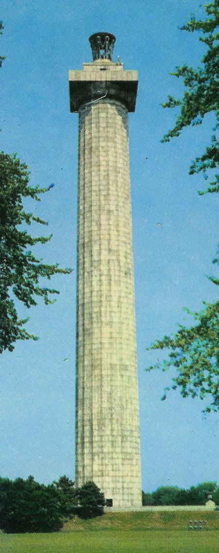
Detail of the Perry’s Victory Memorial, the world’s largest Doric column.

The present-day (2013) name of this National Park is “Perry’s Victory and International Peace Memorial”.

A Stylish Birthday Anniversary Present

August 8, 2013

Can you find the Flatiron Building in this postcard?

SEEING NEW YORK -- Ain't She Stylish!

SEEING NEW YORK — Ain’t She Stylish!

SEEING NEW YORK -- Ain't She Stylish! (reverse)

SEEING NEW YORK — Ain’t She Stylish! (reverse)

Knowing that I had an affinity for views of the Flatiron Building in New York City, for my birthday anniversary this year, one of my sisters presented me with this vintage postcard.  She had found it while browsing through a stack of old postcards at a local flea market.  The couple from the country are dressed in relatively plain garb, and apparently making their first visit to the Big Apple.  While the phrase, “Ain’t she stylish!” is supposed to refer to the New Yorker woman in the fancy outfit, it is no accident that the designer of the postcard, Irwin M. Kline, has staged the NY woman directly in front of the Flatiron Building.  such that the reader soon realizes that “Stylish!” could refer to the Flatiron Building just as much as to the woman in the fancy hat.  The design is copyright 1907, which is roughly five years after the Flatiron Building (originally named the Fuller Building) was constructed.  The new edifice adorning the New York City skyline was an immediate ‘must see’ attraction for visitors to the bustling metropolis.  This post card is number 365 in the”ANGLO LIFE SERIES”.  As of 08/08/2013, there were no “SEEING NEW YORK Ain’t She Stylish!” postcards to be found as active items on eBay, although another postcard in the ‘SEEING NEW YORK’ subseries of the ANGLO LIFE SERIES had recently sold.  That postcard was number 364 in the series, and depicts the same rural couple staged in front of the exact same background image as this postcard.  The man is looking directly at the Flat Iron Building, and the caption reads, “By gosh!  If it should fall!”

Young Miss Columbia – Flag Day 2013

June 15, 2013

Arthur Capper logo on back of postcard.

Young Miss Columbia (untitled) horizontal format published by Arthur Capper - obverse

Young Miss Columbia (untitled) horizontal format published by Arthur Capper – obverse

Front of postcard

Young Miss Columbia (ntitled) horizontal format published by Arthur Capper - reverse

Young Miss Columbia (untitled) horizontal format published by Arthur Capper – reverse

Postmarked from (Paton), Iowa on June 28, 1910.

Written to Miss Fern Tallman in Olin, Iowa by her cousin.

Back of postcard

Washington Park and Sloane House Hotel – Sandusky, Ohio

June 24, 2012

Washington Park and Sloane House, Sandusky, O.

SHAPE & DIMENSIONS: 
Rectangular, approximately 3 1/2″ X 5 1/2″ (~86mm X 136mm) (standard postcard size)

PUBLISHER: 
The Illustrated Postal Card Co., New York & Leipzig

POSTCARD NUMBER: 
47-2 (lower left corner of back)

DIVIDED/UNDIVIDED BACK: 
Undivided back

POSTALLY USED: NO

CATEGORY: 
View

REMARKS: 
A glimpse of the center of Sandusky, Ohio as it existed over a century ago.  This post card is undated, but was likely printed between 1900 and 1906, before the beginning of the divided-back postcard era in early 1907.  Although not postally used, there is an ink inscription along the vertical white strip on the right side of the front.  One can deduce that this postcard was enclosed in a letter with other postcards, since the inscription reads, “In the P. C. ‘Washington Row,’, notice the Sloane House with porch & balconie [sic].”  Indeed, there was a postcard titled “Washington Row, Sandusky, O.”, that was printed in the same time-frame as this postcard, but I do not have that postcard.  The inscriptions on some postcards are self-referential, such as “I visited this place today.”, but this is an interesting example of a postcard inscription that refers to a different postcard!  Although the printed postcard title identifies the major structure as the “Sloane House”, I call it the Sloane House Hotel, in order to distinguish the hotel, which was built in 1880 and razed in 1957, from the still-standing Sloane House, which was the personal residence of Rush R. Sloane, and is currently listed on the National Register of Historic Places.  The original photograph for this printed postcard was taken from the vantage point of one of the upper floors of the Erie County Courthouse, which is located on Columbus Avenue on the other side of Washington Park.  That explains the flower bed in the postcard image that has the flowering plants arranged to spell the word “COURTHOUSE.”  One of the more well-known guests of the Sloane House Hotel was Katherine Hepburn.  She and another actor, Ann Harding, were touring in the autumn of 1940 to promote the film “The Philadelphia Story”, and stayed a night in the Sloane House Hotel.  Apparently, Ann Harding was a descendent of Rush Sloane.

Sandusky, Ohio is the County Seat of Erie County, and is located on Lake Erie at the mouth of the Sandusky River.  Visitors from all over the world come to Sandusky to go to nearby Cedar Point amusement park.Sloan House Hotel Sloan Hotel

2D and 3D Angels – Easter Greeting postcard and April angel ceramic figurine

April 12, 2012

Presented here are two representations of angels – one in two dimensions and the other in three dimensions.  First, a vintage postcard, postmarked in 1910:

Easter Greeting - International Series No. 1142 - obverse

Easter Greeting - International Series No. 1142 - obverse

The front of the Easter Greeting postcard shows a sprig of lilies of the valley flowers, with a rectangular inset in which is depicted a beautiful angel with a silver halo.  She holds a scroll in her left hand.  The back of the postcard shows that the card was published by the International Art Publishing Company, and that this postcard is in the Series number 1142.

Easter Greeting - International Series No. 1142 - reverse

Easter Greeting - International Series No. 1142 - reverse

The three dimensional angel is a porcelain figurine of an angel.   The APRIL emblazoned on her purple sash indicates that this angel is meant to represent the qualities of April, the first full month of Spring.  She holds a wicker basket of Easter eggs in her right hand, and cradles a white bunny rabbit in her left.

April - Porcelain angel figurine holding a bunny rabbit and a basket of Easter eggs - Japan

April - Porcelain angel figurine holding a bunny rabbit and a basket of Easter eggs - Japan

Angel of God, my guardian dear,

To whom God’s love commits me here,

Ever this day, be at my side

To light and guard, to rule and guide.

Franklin Delano Roosevelt – Died on April 12, 1945

April 12, 2011

It was an ordinary Spring day in 1945 when my mother took the car to pick up her father from the barber shop, where he was getting a haircut.  She expected that he would be ready, or nearly so, but as she stopped the car in front of the barber shop and looked through the big plate-glass window, what she saw astonished and perplexed her.  There was her father in the barber’s chair, but the barber had scissors held motionless in mid-air!  In fact, there was no movement at all of the barber, her father or any of the customers.  And they all were staring fixedly at the wall!  It was as though she were gazing into a wax museum!  The traffic was building up behind her automobile, so she drove around the block.  When she returned to the shop, her father was ready to be picked up.  She inquired, “Whatever was happening in the barber shop, that everyone was frozen?”  Her father replied, “We were all intently listening to the radio.  You see, the radio announcer was broadcasting the news that our president, Franklin Roosevelt, has died.”  The date was April 12, 1945.  President Roosevelt died at 3:35 PM, and the news quickly spread across the nation.  Commercial broadcast television was less than four years old, and the few commercial television stations that did exist at the time were off the air during World War II, so the news flash about president Roosevelt’s death was transmitted mostly through the radio medium.  According to the Wikipedia entry for John Charles Daly, Mr Daly, who was a reported for CBS radio, was “…the first to relay the wire service report of the death of President Franklin Delano Roosevelt on April 12, 1945, interrupting “Wilderness Road” to deliver the news.”  the other primary means of disseminating information at that time was the print media, and, at that time, the print medium that was able to deliver news to the citizenry the fastest was the daily newspaper.  President Roosevelt died in “the little White House” in Warm Springs, Georgia, and the Augusta Chronicle published two newspaper articles about the unexpected death of the president in its issue of April 13, 1945.  But it was the radio announcement that had the most impact on the people who heard it.  My mother, and I’m sure her father, too, remembered for the rest of their lives exactly where they were when they heard the news that president Roosevelt had died.  On his blogsite Moments with Clyde, Clyde McDonnell tells the story of the exact circumstances when he heard the news of FDR’s death, thus:

“I was 12 years old when President Franklin Delano Roosevelt died. It was on Thursday, April 12, 1945. I heard the news on the radio of one of my customers on my newspaper route. I sat down on the street curb and cried. I felt as if God had died.”

If you have a story about where you or a relative were when hearing of the death of President Roosevelt, please add a comment at the bottom of  this post, and I will consider including it.
 

Lake Taneycomo from Point Lookout - School of the Ozarks - obverse

Lake Taneycomo from Point Lookout - School of the Ozarks - obverse

Lake Taneycomo from Point Lookout - School of the Ozarks - reverse

Lake Taneycomo from Point Lookout - School of the Ozarks - reverse

Very soon after the president’s death, The Post Office Department announced a series of four commemorative postage stamps: The design of the stamps all show the portrait of FDR in an oval on the left side of the stamp, with “Roosevelt” centered under the oval, and “1882” and “1945” bracketing the lower area of the oval.  The three cent stamp was issued first (in 1945, three cents was the first-class postage rate to mail a letter that weighed less than one ounce), with a first day of issue of June 74, 1945.  The one cent commemorative stamp was issued next (one cent was the rate to send a post card in 1945), on July 26, 1945.  The two cent stamp followed on August 24, 1945, and a five cent stamp rounded out the commemorative series, with a first day of issue of January 30, 1946.

So, the one cent stamp on this postcard had been available for a little under two months when Jennie applied it to the postcard that she sent to Clifford Daniels on September 14, 1945.  The postcard is postmarked with a machine cancel from Princeton, Illinois (the county seat of Bureau County).  The stamp was taken from the upper edge of the sheet of stamps, as indicated by the selvedge still attached to the top of the stamp.

The view on the obverse (front) of this linen-era postcard is:

LAKE TANEYCOMO FROM POINT LOOKOUT, SCHOOL OF THE OZARKS

“IN THE BEAUTIFUL OZARKS, LAND OF A MILLION SMILES”

The reverse (back) of the postcard has a short description of the origin of the word “Ozarks”:

“The origin of the name ‘Ozarks’ has been traced to a term used by early French-Canadian Trappers–‘Aux Arcs,’ meaning ‘with bows’–to designate Indian tribes native to this region.”

Bluebird of Happiness — Happiness of Bluebirds

March 13, 2011
Solid glass bluebird made by Fenton Glass

Solid glass bluebird made by Fenton Glass

For my birthday anniversary several years ago, my sister Susan (contributor to This Old Paper and Ditalini Press), presented me with a beautiful Fenton Glass bluebird. I have it on the fireplace mantle, where I can admire the cobalt-blue glass bird from my work desk.

In thanks for the pleasure derived from this solid-glass bluebird of happiness, I am mailing to Susan the original of the vintage postcard featuring bluebirds illustrated here:

Bluebirds postcard by Stecher (623 D) - obverse

Bluebirds postcard by Stecher (623 D) – obverse

Bluebirds postcard by Stecher (623 D) - reverse

Bluebirds postcard by Stecher (623 D) – reverse

The printed inscription on the front of the postcard is, “The Bluebirds bring to you my Greetings”. In the foreground, a pair of bluebirds are depicted perched on a rustic, wooden roost, while two more bluebirds can be seen soaring in the puffy-clouded sky in the background. A woman walks up the path toward the front door of a log cabin that features a red brick chimney. The grass is a verdant green, and two stout trees in full foliage round out this picturesque rural scene. in addition to black ink, the other colors of ink used to create this postcard appear to be brown, blue, red, and two shades of green. The entire perimeter is slightly embossed, as are the following features: The foreground bluebirds, the rustic wooden roost and the tufts of grass around the base of the roost, both trees, and the woman. The design is not artist signed.

This card is published and copyright by Stecher Lithographic Company, located in Rochester, New York. The small, circular Stecher logo is located in the lower left corner of the front of the post card. It reads: STECHER LITH. CO. ROCH. N. Y. around the circumference of a circle with a C in the middle of it:

Stecher Lithographic Company (623 D) - Detail of logo

Stecher Lithographic Company (623 D) – Detail of logo

A short company history of the Stecher Lithographic Company is found in volume XXXV (1982) of the University of Rochester LIbrary Bulletin, in an article entitled “Nineteenth Century Rochester Fruit and Flower Plates” by Karl Sanford Kabelac. The article is available online at the University of Rochester‘s River Campus Libraries website, posted by the Department of Rare Books, Special Collections and Preservation. Scroll nearly halfway down the webpage for the section about The Stecher Lithographic Company. Although the focus of the article pertains to printers in the Rochester, New York area who made plates (prints) of fruits and flowers to illustrate the catalogues of the botanical offerings of local nurseries, the Stecher Lithographic Company also printed numerous postcards during the golden age of postcards. Wikipedia mentions that Frances Brundage illustrated for the Stecher Lithographic Company, although the entry does not specifically state that she illustrated postcards for Stecher, which also printed illutrated books.

On the reverse of this bluebirds greetings postcard, we find out that this is Stecher’s postcard Series 623 D (lower left corner). The ‘D’ indicates that this postcard is the fourth design in series 623. In addition to being sold individually, postcards often were sold in packets, and the postcards in a thematic packet would bear the same series number, but each unique postcard design within the packet would have its own letter designation. For example, if a packet contained twelve postcards, each with a unique design, then the postcards typically would have letter designations from ‘A’ through ‘L’ following the series number.

The back of this postcard has the phrase “MADE IN U. S. A.” located about a third of the way from the top of the message side. The phrases “FOR CORRESPONDENCE” and “FOR ADDRESS ONLY” (each underlined) are symmetrically located at the top of the vertical divider line, on the left side and the right side, respectively. The stamp box in the upper right corner of the reverse is defined by two, nested thin lines, and is nearly square, being only slightly higher than wide. Inside the stampbox are three lines of text:

PLACE STAMP

DOMESTIC 1¢

FOREIGN 2¢

The words “POST CARD” are centrally featured across the top of the back of the postcard. The letters have slight serifs, and the serifs at the ends of the horizontal bar of the “T” both point out (away from the central, vertical bar of the “T”).. The “C” of CARD has lots of curvilinear flourishes emanating from it.

The card is postally unused, but there is a name written in pencil, toward the top of the address side of the postcard. The name is crudely scrawled, and written over an erasure, but appears to be “Mr. A. Teribery”. Having never passed through the United States Post Office, there is no postmark date to use as a temporal guide. However, since the postcard has a vertical divider line, allowing for a message to be placed on the back of the card, then the card must have been printed after March 1, 1907, which is the date that the U. S. Post Office allowed a message to be written on the side of the postcard that had previously been reserved for the address only.  Based on the physical characteristics of the card, as well as the postmarks of other Stecher Lithographic Company postcards in my collection, a reasonable estimate of publication date for this particular postcard is in the range of 1907 to around 1925.

“For your Happiness”, here is another Stecher postcard featuring bluebirds:

For your Happiness - Stecher Series 683 D - obverse

For your Happiness – Stecher Series 683 D – obverse

For your Happiness - Stecher Series 683 D - reverse

For your Happiness – Stecher Series 683 D – reverse

The above postcard is in the Stecher Series 683, and also just happens to be the ‘D’ design of the series. The front of the postcard features a four-line verse in the upper-right quadrant:

I’m sending these Bluebirds

As a merry sign

Of the Joy I’m wishing

A friend of mine.

The font of the verse is an italic, sans-serif font, printed in black ink. Underneath the verse are two large bluebirds in flight, with wings intersecting, as well as a smaller bluebird in flight near the bottom of the postcard. The other major design element of the postcard front is a vignette of a rural farm scene, with a stylized birch tree in the foreground, just to the left of a winding dirt path that leads to a farm house and barn in the background. There is a flag flying on a flagpole to the right of the barn, and a tall, conical structure behind the farm house, which might be meant to represent a silo. The left side of the design is bordered with eight daisy-like flowers, on green stems of varying lengths. Underneath the farm vignette is printed in black ink: FOR YOUR HAPPINESS, with flourishes on the ‘F’, ‘R’, ‘H’ and “N’. The entire edge of the postcard is bordered in light blue, and the Stecher Lithographic Company logo (identical to the Stecher logo in the first postcard) is printed in black ink in the lower-left corner. The bluebirds and the daisies (stems included) are lightly embossed. As with many, if not the majority, of the postcards that feature a small vignette as the primary design element, this postcard is not artist signed.

The printing on the “For your Happiness” postcard back is identical to the printing on the reverse of the first Stecher postcard. This postcard, however, bears a stamp, although it is not postally used. The inscription, is written in black ink with a fountain pen:

“Many happy returns of the Day, is the wish of your friend”

is signed by Alwine Buth, and addressed to:

Miss Tena Memken.

1459 Bates Ave.

City.

Using only online search engine queries (without recourse to databases available through special library-only access), I was able to determine that the “City” is Springfield, Illinois. Please comment below if you figure out what search terms were used in the online search to identify the name of the city. Arriving at a credible estimate of the date that the postcard was printed or used is a bit more challenging, since the postcard, although stamped, was probably hand-delivered by Alwine Buth to Tena Memken, or was included in a letter written by Alwine Buth to Tena Memken, and thus was never postmarked by the U. S. Post Office.* However, the stamp itself reveals at least an earliest date that the postcard could have existed. This one cent, green stamp bearing the likeness of George Washington is similar to the style of postage stamp that was affixed to untold thousands of vintage postcards. Stamps that all look pretty much identical to the postage stamp on this postcard were issued for nearly eleven years, from February 12, 1912 tthrough January 16, 1923. Without close examination, these one cent stamps all look the same. However, there are subtle differences in the stamp as it was released and rereleased by the Post Office Department. This particular stamp happens to be “Perf 11”, both horizontally and vertically, meaning that there are eleven perforations per each two millimeter length. The perf 11 version of this one-cent was issued on March 23, 1917, so this postcard was produced by Stecher (and then used by Alwine Buth) sometime after that date. Since (according to familysearch.org) Alwine Buth was born in 1900, and Tena Memken was born in or about that same year, that would make Alwine seventeen years old or older at the time of penning this happy thought, and would explain why Tena was still a “Miss”, being in her late teens or early twenties.

*I favor the theory that, after wrting the postcard and placing a postage stamp on it, Alwine decided to write a longer message in the form of a letter to Tena, and thus included the postcard inside of the envelope that contained the letter, even though she had already put a postage stamp on the postcard. I base this theory on the evidence of two small (about one-qurter inch deep) tears in the top edge of the postcard, separated by approximately one and three-eigths of an inch, with semi-circular stress marks between the tears. I surmise that these might have developed when the postcard was (accidentally) mishandled while being removed from the envelope, the recipient not expecting there to be an enclosure other than the letter.

Let us now examine a non-Stecher vintage postcard featuring bluebirds:

The Bluebirds for Happiness - Obverse

The Bluebirds for Happiness – Obverse

The Bluebirds for Happiness - Reverse

The Bluebirds for Happiness – Reverse

This postcard features a four-line poem, entitled “The Bluebird for Happiness”

This merry little feathered friend,

So cheery, bright and blue,

Because he brings true happiness,

I’m sending him to you.

The postcard has been mailed, with a postmark cancellation from Swanton, Vermont, postmarked February 27, 1920. The postcard has been used as a birthday greeting, with this undated inscription, written in black ink using a fountain pen:

“Hello Dad, Many Happy Returns for your Birthday. You’ll soon be as old as I. Also wishing you many more Birthdays. Dorothy.”

The card is addressed to a Mr. B. E. Stearns, Swanton, Vermont, #5. 24. (Probably meaning Rural Route 5, Box 24.). The actual date of Mr. Stearn’s birthday anniversary is not stated. I wonder if it might have been February 29th, since 1920 was a leap year? Aha!! His birthdate WAS most likely February 29th!! I had been puzzled about the inscription of his daughter, but it is quite clear now! Talk about a conundrum! I couldn’t figure out why Dorothy would write: “You’ll soon be as old as I.” The only way that a father can credibly be said to be younger than his daughter is if the father has only one birthday anniversary every four years! Since Dorothy’s handwriting appears to be well developed, she was probably older than elementary-school age. This would mean that on February 29, 1920, her father would have been one of these ages (actual age/leap-year age): 52/13; 56/14; 60/15. My guess is that Dorothy was born when her father was 44 years old. If that were the case, then, when Dorothy was sixteen years old, her father would be celebrating his fifteenth leap-year birthday (actual age: sixty years old), and the postcard would make the most sense. That was fun! If I get an opportunity, I will try to research archival records to determine if my theory is borne out (Apologies for the intentional pun). Update: Research using Ancestry.com Library Edition tells a different story. The Vermont death certificate for Burton E. Stearns gives a date of birth of February 19, 1857. Since 1857 is not a leap year, my solution to the puzzling birthday greeting message is disproven. By the way, Dorothy may have been named for her grandmother on her father’s side, since Burton E. Stearns was the son of Eldad A. Stearns and Dorothy Stearns (per the 1880 Federal Census), AKA Dolly Stearns (per the 1860 Federal Census).

Along the left edge of the reverse (back side of the postcard) is printed: Series 727, Messages — 24 Designs. Indeed, there is a very faint 727 in the lower left area of the obverse. I have not yet determined the printer or the publisher of this postcard, but the words “POST CARD” are distinctive, in that the angled descender of the letter R is a gentle arc that connects to the middle of the bottom of the letter D. Another distinguishing feature of POST CARD is the presence of a small dot in the center of the letter C. If anyone reading this post can shed light on the publisher, please comment below. The card is not embossed, but the front has what I term a pigskin surface, composed of fine, irregular indentations, probably to allow the ink to form a stronger bond with the surface of the card stock. Also of note is the white border around the front image, which indicates that this postcard was most likely printed in the United States rather than in Germany, probably sometime between 1914 and early 1920.

For some stunning photos of bluebirds in North Carolina, have a look at this post by Sweetbay, titled “Bluebirds in the Snow“.

bluebrid

Simmery Summery Day – Simmery Summery Birthday

February 18, 2011

_

Birthday Greetings - obverse
Birthday Greetings – obverse

Birthday Greetings


It is your birthday, and I wish you happiness.

You are passing another milestone;

May the miles that lie ahead of you go through

Plains of peace and over hills of joy.


Birthday Greetings - reverse

Birthday Greetings - reverse

_

On A Simmery Summery Day

On A Simmery Summery Day

_

To You Sweetheart, Aloha

To You Sweetheart, Aloha

_

Walk-Over Shoes – The George E. Keith Company – Katharine Maynadier Browne

October 26, 2010

The fashion in shoes one hundred years ago was quite different from the footwear designs of the twenty-first century, yet at least one shoe manufacturer, the George E. Keith Company, was as eager to use one of the most popular media of the early nineteen hundreds — the picture postcard — for advertising purposes as shoe companies of the two thousands are to use the world wide web as an advertising vehicle.  Presented here are four vintage postcards that advertise Walk-Over shoes for women:

*+*+*+*  BEGIN POSTCARD 1  *+*+*+*

The Walk-Over Shoe - storefront display - obverse

The Walk-Over Shoe - storefront display - obverse

The Walk-Over Shoe - storefront display - reverse

The Walk-Over Shoe - storefront display - reverse

Walk-Over shoes postcard 1 — The advertising slogan on the reverse reads:  They’re as stylish as comfortable and as durable as they are stylish–Walk-Over shoes

*+*+*+*  END POSTCARD 1  *+*+*+*

*+*+*+*  BEGIN POSTCARD 2  *+*+*+*

The Walk-Over Shoe - three children – obverse

The Walk-Over Shoe - three children – obverse

The Walk-Over Shoe - three children – reverse

The Walk-Over Shoe - three children – reverse

Walk-Over shoes postcard 2 — The advertising slogan on the reverse reads:  Fashion’s favorite–Walk-Over shoes

*+*+*+*  END POSTCARD 2  *+*+*+*

*+*+*+*  BEGIN POSTCARD 3  *+*+*+*

The Walk-Over Shoe - dog cart – obverse

The Walk-Over Shoe - dog cart – obverse

The Walk-Over Shoe - dog cart – reverse

The Walk-Over Shoe - dog cart – reverse

Walk-Over shoes postcard 3 — The advertising slogan on the reverse reads:  Fair weather friends and stormy day comrades–Walk-Over shoes

*+*+*+*  END POSTCARD 3  *+*+*+*

*+*+*+*  BEGIN POSTCARD 4  *+*+*+*

The Walk-Over Shoe – Dutch door – obverse

The Walk-Over Shoe – Dutch door – obverse

The Walk-Over Shoe – Dutch door – reverse

The Walk-Over Shoe – Dutch door – reverse

Walk-Over shoes postcard 4 — The advertising slogan on the reverse reads:  Comfort’s choice–Walk-Over shoes

*+*+*+*  END POSTCARD 4  *+*+*+*

Here is a detail-image of the Walk-Over shoes for women logo that appears in the lower right corner of the obverse (front) side of each postcard:

Walk-Over shoes - Logo detail

Walk-Over shoes - Logo detail

The printing quality of these post cards is quite low, but you can get a much better idea of the Walk-Over shoe for women logo by looking at the second image at the  WALK-OVER SHOES blog posted by Vintage123.  That post consists mainly of images of a vintage Walk-Over shoes catalog published by the manufacturer.   The catalog is undated, but from the looks of the shoes displayed in the catalogue, the era is probably right in the 1907-1908-1909-1910-1911-1912-1913 era.  The logo consists of a wasp-waist woman walking over an oversized  Walk-Over shoe with a confident stride.  The slogan or motto of the Walk-Over shoe is “The Sign of Satisfaction”.  The illustration goes on to proclaim “Walk-Over Fashions”, and gives the location of the shoe manufacturer as:  The WALK-OVER Plant, Campello, Brockton, Mass, U. S. A.

Here is a link to a fascinating history of the Keith family who settled in the  the vicinity of Bridgewater, Massachusetts, including Brockton, Massachusetts and the neighborhood on the south side of Brockton, Campello. Note especially entry (VIII) for GEORGE ELDON KEITH, who is the Geo. E. Keith of the George E. Keith Company, Inc.   This snippet from his biography is as much food for thought today as it was when written in 1912:  “Whether the elements of success in life are innate attributes of the individual, or whether they are quickened by a process of circumstantial development, it is impossible to determine clearly; yet the study of a successful life is none the less interesting and profitable by reason of the existence of this same uncertainty. So much in excess of successes is the record of failures that one is constrained to attempt an analysis in either case, and to determine the method of causation in an approximate way. The march of improvement and progress is accelerated day by day, and each moment seems to demand a man of broader intelligence and greater discernment than did the preceding one. Successful men must be live men in this age, bristling with activity; and the lessons of personal history may be far-reaching to an extent not superficially evident.”

Each of these postcards is what is termed an “artist signed” postcard.  This does not mean that the postcard contains the handwritten signature of the artist/designer of the postcard image.  In fact, not even the printed signature of the artist.  The term artist signed is applied to any postcard that has the attribution of the artist printed on the postcard, usually on the image (front) side.  On the front of each postcard is printed (in small font): “KATHARINE MAYNADIER BROWNE 1909”, but printed using four lines, thus:

 KATHARINE

MAYNADIER

   BROWNE

      1909

Using web-based research, I discovered that Katharine Maynadier Browne was the illustrator of the 1909 childrens’ book (with 84 pages):  Little Stories About Little Animals for Little Children by Susan Holton, published in Boston by Leroy Phillips.  According to a listing on the website of Carpe Diem Fine Books, Katharine Maynadier Browne also was the designer of the decorative endpapers for the book Madame Angora, a later printing of the 1901 book by Harriet A. Cheever. The endpapers by Browne are dated 1910.   This book was published by Dana Estes, also of Boston, Massachusetts.  Perhaps oddly, Katharine did not also supply the illustrations in the book.  That may be a good thing, though, since, according to the Carpe Diem listing, the illustrations are by Jo J. Mora.  Apparently, bibliophiles cotton to books illustrated by Jo Mora, whereas Katharine M.  Browne exists in relative obscurity.  I deduce from her supplying artwork for two books printed in Boston in the 1910 era, that Katharine was a Boston-area artist/illustrator who received a commission to create a series of picture postcards for the George E. Keith Company.  Note that the postcard images themselves are not particularly footwear-centric, except postcard number 1, which shows Walk-Over shoes in a store window display.  Also, postcard number 2 shows an American girl wearing shiny leather shoes, perhaps patent leather shoes, sitting on a dike between a Dutch boy and a Dutch girl.  In fact, all of the other persons illustrated on the postcards are Dutch, and shown wearing wooden shoes.  Of all of the kinds of shoes that were manufactured by the George E. Keith Company, I have found no references that cite the production of wooden shoes!  What can explain the presence of wooden shoes on postcards meant to entice people to buy leather WalkOver shoes?  Well, almost anything Dutch was wildly popular during the golden age of postcards, so the presence of the Dutch scenes (windmills, Dutch doors, dikes, wooden shoes) helped ensure that the postcard series would be a good seller.  I use the term “series” loosely, because although the four postcards presented here were obviously printed on or around the year of the illustration copyright (1909), the postcards are not numbered or sequenced in any way.  The numbering scheme for the postcard images above is simply the order of presentation or appearance in this blog.  There are many more vintage postcards in this series, some that were copyright 1909 such as the ones presented here, and others that were in a nearly-identical (in theme, not in illustration) series published (or at least with illustrations copyrighted) the next year, 1910.

I solicit comments from anyone who has more information on this enigmatic artist/illustrator, Katharine Maynadier Browne, who seems to have appeared on the art scene in the Boston area in 1909, and then dropped below the radar after 1910.  Does anybody have any earlier or later examples of Katharine’s artwork?

This post is part of a ‘Festival of dollparts: October 13th – 26th’, in support of our friend Michelle’s dollparts Kickstarter campaign. The theme is any kind of old paper and ephemera about apparel and fashion. Read her Kickstarter profile page :: here :: and throw in $1 or more for a very worthy fashion project. Any other bloggers, feel free to dig for mercantile magic flatstuffs and join the festival.

waspwaistwoman

Unusual locomotion in Hartford, Connecticut – circa 1910

August 21, 2010

Let us take a glimpse into the Hartford, Connecticut of the early twentieth century, focusing on some unusual forms of locomotion.  We shall use as our looking glass the lens of vintage postcards, four to be exact, and let them weave a story.

FIRST postcard – Combination Car

Combination Car, Engine House No. 2, H. F. D., Hartford, Conn.

A Combination Car used by the Hartford Fire Department, circa 1910

Obverse caption:  Combination Car, Engine House No. 2, H. F. D. , Hartford, Conn.

A combination car was used by the fire department as a conveyance for both chemicals and hoses.  Note the polished brass chemical fire extinguisher mounted next to the driver of the fire engine, and the coiled fire hose directly behind him.  An extension ladder also can be seen attached to the far side of the vehicle.  Since this card is postmarked in 1910, the combination car pictured is a very early model that used gasoline as its motive power instead of horses.  The drive train consisting of chains and gears is visible in front of the rear wheels.  The gas tank is barely visible under the front of the vehicle, and the gasoline engine was most likely mounted under the center of the car, since the crank between the O and M of COMBINATION was probably used as the engine starter.  A beacon or searchlight is mounted on the front of the fire engine, and two kerosene lanterns are affixed to the upper corners of the rear body.  Five uniformed firemen of the Hartford Fire Department, Engine House Number 2, are seated in the machine, ready to spring into action should the fire bell ring.  A young man in the background admires the shiny new piece of firefighting equipment.

SECOND postcard – Life Net

A dozen Hartford firemen demonstrating the life net

Life Net, Engine House No. 14, H. F. D., Hartford, Conn.

Obverse caption:  Life Net, Engine House No. 14, H. F. D., Hartford, Conn.

In this vintage post card, another item in the firefighter’s arsenal is displayed:  The life net!  While the life net is not in itself a means of locomotion, it certainly can be considered the life-saving brake when a person, trapped by flames and suffocating smoke, must jump from an upper-story window and use the force of gravity as the sole means of locomotion.  Eleven firemen of the Hartford Fire Department, Engine House Number 14, hold the circumference of the sturdy rope-mesh life net with a firm grip, while a twelfth firefighter stands ready to direct the others to the exact location required to ensure a safe deceleration and gentle return to terra firma.

Dave Dube of Old Paper Art inquires about the “HOSE” lettering above the middle bay doors:

Detail of HOSE over bay door on Life Net postcard

Detail of HOSE over bay door on Life Net postcard

The font is somewhat unusual, being slightly wider than high, which gives the letter O the appearance of an egg laying on a table.  Perhaps the stone engraver felt constrained by the dimensions of the keystone.  I do not know why that particular bay is labeled, whereas the bays on either side of it appear to be nameless.  One of the more interesting aspects of this postcard view is the reflections that can be seen in the large glass windows of the bay double-doors, and even in some of the smaller glass panels.  Apparently, the fire house building was constructed across the street from a park or vacant land, or at least a tree-lined roadway, since trees easily can be seen in the reflections.  The trees are leafless, indicating that the original photo upon which this lithochrome postcard is based must have been taken in early spring or late autumn.

THIRD postcard – Police Station

A horse and carriage look diminuitive compared to the massive gray facade of the Hartford Police Department building

Police Station, Hartford, Conn.

Obverse caption:  Police Station, Hartford, Conn.

The impressive stone edifice of the Hartford, CT. Police Department dominates the obverse of this card postmarked on June 23,1910.  A carriage whose motive power is a one horsepower engine – meaning, that is, a single horse – is parked outside of a main entrance to the building.  The vehicle bears signage on the black-paneled side, but the words are not legible at the resolution of the litho-chrome printing method employed by the printer.  So, one can speculate that this might be some sort of official conveyance, perhaps the police cruiser or paddy wagon of its day.  It could also be a horse-drawn taxi cab, or the carriage used by one of the local Hartford businesses to deliver supplies to the police department.  The sender of the postcard has written in the upper-right corner of the postcard front: “That is where they’re going to put me next”

FOURTH postcard – Knabenshue Air Ship

Dirigible piloted by A. Roy Knabenshue in Hartford, Connecticut 1907

KNABENSHUE AIR SHIP, HARTFORD, CONN. DECORATION DAY, 1907

Obverse caption:  KNABENSHUE AIR SHIP, HARTFORD, CONN. DECORATION DAY, 1907

The airship – or dirigible – pictured on the obverse of this postcard was not an everyday fixture of the City of Hartford, Connecticut, but rather was a special feature brought in by its owner, Augustus Roy Knabenshue – aka Roy Knabenshue – just for the Decoration Day festival held in 1907.  The dirigible was powered by a small gasoline engine that drove a propeller, and A. Roy Knabenshue was able to pilot the lighter-than-air craft with amazing dexterity.  It’s a good thing that the airship would make a nearly vertical ascent, because it would be well-nigh impossible to navigate along the ground through the sea of hundreds, if not thousands, of eager onlookers.  Perhaps the Hartford fire department was on hand, ready with their combination car to aid Roy Knabenshue if his hydrogen-filled gas bag caught on fire.  The emergency crew should bring the life net to the scene, too, in case Mr. Knabenshue fell from the dizzying heights that his wonderful air-ship could take him.

Now here are the images of the backs of the postcards.  These are not presented in the same order as the fronts (above), since the first three postcards are all from the same sender (C. E. L., Jr.) to the same recipient (Miss Elsie Flansburg), and are presented in chronological order according to the postmark date.

*+*+* BEGIN LIFE NET REVERSE *+*+*

Life Net, Engine House No. 14, H. F. D., Hartford, Conn. - reverse

Life Net, Engine House No. 14, H. F. D., Hartford, Conn. - reverse

Life Net reverse (Postmarked May XX, 1910 10:00 AM from Elmwood, Connecticut):

Dear Elsie: I received your picture and thank you very much.  Charles E. and I are going to have some little pictures taken.  I will send you one of those and one of Dick and me when I get some finished.  Yours C. E. L., Jr.

Then at the top of the back of the postcard, C. E. L. has written: P. S. We play a game at Pope Park 1st diamond Sat. afternoon.

*+*+* END LIFE NET REVERSE *+*+*

*+*+* BEGIN COMBINATION CAR REVERSE *+*+*

Combination Car, Engine House No. 2, H. F. D., Hartford, Conn. - reverse

Combination Car, Engine House No. 2, H. F. D., Hartford, Conn. - reverse

Combination Car reverse (Postmarked June 2, 1910 6:00 PM from Elmwood, Connecticut):

Dear Elsie:  We won the game Sat. 11-12.  We came near getting beat but Chas. Elwood brought in the winning run.  If you come over to any of our games bring another girl because there is none that go from here.  The message is unsigned, but is evidently from C. E. L., Jr.

Then at the top of the back of the postcard: Come out before you go away. WLOL

 *+*+* END COMBINATION CAR REVERSE *+*+*

*+*+* BEGIN KNABENSHUE AIRSHIP REVERSE *+*+*

KNABENSHUE AIR SHIP, HARTFORD, CONN., DECORATION DAY, 1907

KNABENSHUE AIR SHIP, HARTFORD, CONN., DECORATION DAY, 1907

Roy Knabenshue airship reverse (Postmarked July 16, 1910 10:00 AM from Elmwood, Connecticut):

Dear Elsie, please let me know when you go out to South Bethlem. And your address.  I wish you could come out before you go away.  I don’t know much this morning.  I have got to go after ice this afternoon. I wish you could come.  Yours, CEL., Jr.

 *+*+* END KNABENSHUE AIRSHIP REVERSE *+*+*

*+*+* BEGIN HARTFORD POLICE STATION REVERSE *+*+*

Police Station, Hartford, Conn.

Police Station, Hartford, Conn.

Police Station, Hartford, Connecticut reverse (Postmarked June 23, 1910 9:00 PM from Hartford, Connecticut):

Hello old chap didn’t mean to make you wait so long.  Have been busy with the girls and got careless about writing.  Hope you are getting along good with the girls and don’t kiss them too much.  Please excuse writing awful bad pen ain’t got a cent to buy another.  Ans soon Ed. B.

*+*+* END HARTFORD POLICE STATION REVERSE *+*+*

These vintage postcards are presented as the entry in the Festival of Postcards 9th Edition: Locomotion.

23 Skidoo – The Flatiron Building – New York City

April 28, 2010
Greetings_from_New_York_City_obverse

Greetings_from_New_York_City_obverse

Greetings_from_New_York_City_reverse

Greetings_from_New_York_City_reverse

Please see Note 1 for description of Greetings from New York City postcard.

Flatiron_District_coutesy_of_MapQuest

Flatiron_District_coutesy_of_MapQuest

Above:  Map of the Flatiron District of New York City, courtesy of MapQuest.

The metaphorical intersection of architecture, idiomatic phraseology, and – at least to some extent – postcards, all converged on the geographic intersection of Fifth Avenue, Broadway, and 23rd Street in New York City in the very early 1900s to produce what some lexicographers consider to be the first fad phrase to sweep the entire nation: “23 skidoo” (sometimes spelled “23 skiddoo”).  There are many theories as to the origin of 23 skidoo, but the following explanation is the one  that seems most believable to me.

Around 1902, construction was completed on one of the tallest buildings in New York City, the 21-story Fuller Building, which would house the headquarters of the Fuller Construction Company.  Chicago architect Daniel Burnham designed the structure to fit on the slice-of-pie-shaped parcel of land formed where Broadway and Fifth Avenue intersect at a sharp angle with 23rd Street.  Since the triangular outline of the resulting skyscraper resembled a flat iron, the building was referred to as the flat iron building, and the name officially was changed to the Flatiron Building soon after construction.

Fuller_Building_obverse

Fuller_Building_obverse

Fuller_Building_reverse

Fifth_Avenue_and_Flat_Iron_Building_obverse

Fifth_Avenue_and_Flat_Iron_Building_reverse

Fifth_Avenue_and_Flat_Iron_Building_reverse

Please see Note 2 for description of Fifth Avenue and Flat Iron Building postcard.

Both Broadway and Fifth Avenue are major thoroughfares in the city, and air currents would flow along those streets much like air is channeled through a canyon.  Due to its location on 23rd Street at the convergence of these two canyon-like roads, the air currents mixed and swirled around the apex of the Flatiron Building, causing unusual wind patterns that included the occasional updraft, which would tend to lift the long skirts worn by women in the very early 1900s.  As soon as it became known to the local male population that this was the case, men began to gather on Twenty-third Street at the base of the Flatiron Building to gawk.  The intersection was already one of the busiest in New York City, so police would be on foot patrol in the area to shoo away these thrill-seeking loiterers who were clogging the sidewalks.  My tattered old Webster’s Dictionary defines “skidoo” (actually, the entry is spelled “skiddoo”) thus: “to go away; leave: usually in the imperative.”  So, the officer’s command to the loitering men, “Leave immediately!” became known as the “23 skidoo”.

Here is an example of just how windy the conditions could be:

(Please note that this video must fully load before it begins to play.)  At the Foot of the Flatiron (filmed November 2, 1903). 24 seconds into the film, watch as a man enters the scene from from left to right.  As he turns to look at the movie camera,  the wind lifts his hat right off of his head!  Also, at about 1 minute 40 seconds, a lady purchases a newspaper from a newsboy just out of the movie camera view (they enter from the right).  She huddles against the base of the Flatiron building to read the newspaper, but the wind is whipping around so fiercely that the newspaper is completely unmanageable, and she exits the scene to the left, clutching the crumpled remains of what had just moments before been a pristine paper!  Also, one or more local beat policemen are seen at three different times in just this short film that is less than three minutes in length.

23 skidoo might have remained an idiomatic phrase merely local to NYC, perhaps even just to Midtown Manhattan, were it not for the fact that in the second half  of the first decade of the 1900s (1905, 1906, 1907, etc.), the picture postcard was becoming extremely popular as a means of sending quick, short messages.  Having just been built in 1902, and being one of the tallest buildings in New York at the time (the Park Row Building, built in 1899, was the tallest), the Flatiron Building was a natural as an image to grace the front of a picture postcard.  Some postcard publishers, banking on the knowledge that the unusual air patterns around the Flatiron Building were liable to cause what might today be called a “skirt malfunction”, even pictured women with skirts aflutter in front of the famous building.  Here is an example of one such post card, with the caption:

A flat iron is a good thing for doing up skirts

Such postcards were sent across the nation, and even around the world, and so it is that the postcard may have been instrumental in the viral spread of the phrase 23 skidoo.

The term itself is the subject of this postcard:

23_Skidoo_obverse

23_Skidoo_obverse

23_Skidoo_reverse

23_Skidoo_reverse

The sender saw no need to send the recipient a long “Dear John” letter.  It took only this one sentence on a suitably chosen postcard to end the relationship:  “Well Jess, I thought it over and this is the ans on the other side.”  Note that along the bottom of the obverse is “COPYRIGHTED 1907  D HILLSON”, indicating that the term 23 skidoo was already so well known by 1907 that it had its own postcard!  The postmark on the reverse is unreadable (the card is printed on card stock that is coarsely textured on both sides), but the one cent stamp commemorating the founding of Jamestown in 1607 was issued in 1907 (for the tercentenary anniversary), so the postcard was almost certainly sent in 1907 (commemorative stamps were only available at the post office for a limited time).  According to the address, the recipient lived in the area of Scio, Ohio, and so the sender must have assumed that someone in  the little village of Scio (Harrison County) in southeast Ohio would have understood that “23 skidoo” meant “scram” or “skedaddle”.

Update of 01/03/2011:  Happy New Year 2011!  As if to celebrate the arrival of this newly minted year, the blogsite 23 skidoo postcards today posted images of  hundreds of postcards that relate to the phrase “23 skidoo” either by having 23 or skidoo or both on the front of the postcard.   I am officially adding 23 skidoo postcards to my blogroll.  I noticed in their “Police” and “Messengers” section the images of several postcards that were published by Samson Brothers, so I present one as a way of officially welcoming 23 skidoo postcards to my postcardiness blogroll:

Barton & Spooner:  "I SHOULD WORRY...Doctor" obverse

Samson Brothers: “I SHOULD WORRY…Doctor” obverse

Barton & Spooner:  "I SHOULD WORRY...Doctor" reverse

Samson Brothers: “I SHOULD WORRY…Doctor” reverse

Note especially the presence of the distinct outline of the Flatiron Building in the panorama of buildings that forms the background of the illustration.  Note, too, the prominent “23” emblazoned on the brass badge across the front of the messenger’s cap.  Although many postcards feature “23” or “skidoo”, very few actually link the terms with the Flatiron Building on the same postcard.  This postcard, however, provides irrefutable postcard evidence that “23”, and — by extension — “23 skidoo” were linked in the popular imagination with the Flatiron Building.  So, welcome 23 skidoo postcards!

The phrase 23 skidoo is still in use today, although it is not as wildly popular as it was in the early twentieth century.  23 skidoo lives on in the name taken by the hip-hop-for-kids (and adults!) artist Secret Agent 23 Skidoo.

Here is his “Gotta Be Me”, available on the recently released CD “Easy“:

Fun facts:  The address of the Flatiron building is 175 Fifth Avenue, New York, NY 10010.  The Flatiron Building has its own facebook page.

Being so tall and narrow, most postcard views of the Flatiron Building are composed vertically, so that the image is properly viewed when the postal card has the shorter edges at the bottom and top, and the longer edges on the left and right side.  In fact, postcards of the Flatiron Building that are meant to be held in the normal, horizontal, position are only found infrequently.  But just one such card that shows the skyline of the Flatiron District with the Flatiron Building in the center is featured as the seventh (and final) postcard in We are well and HAPPY, posted by Susan E. of  This Old Paper.  It is well worth a look, since such a view is so unusual.  You can click on the image to get an enlarged view.  The post chronicles the honeymoon in New York City of Emily and Joseph Schifferli in August, 1906, by way of the postcards that they sent back to relatives in Buffalo, New York.  Most people think of Niagara Falls as a honeymoon destination, but for the newlywed Schifferli couple, apparently the Flatiron Building, only four years old, already was a “must see” destination while in New York City.

For your viewing pleasure, more postcard views of the Flatiron Building are provided below.   Your comments about any aspect of this post are solicited!

This post is being submitted to the Festival of Postcards, coordinated by Evelyn Yvonne Theriault, since the theme of this Festival (8th Edition) is “Geo.”  July 16, 2010 update:  The Geo edition of the Festival has been posted!

 Note 1
Obverse: “Greetings from New York City”.  Stylized street map with the following labels:  Trinity Church, Woolworth Building, City Hall, Empire State Building, Metropolitan Opera, Times Square, Madison Square Garden, New York Coliseum, Laguardia Field, United Nations, Eastside Airlines Terminal, Grand Central Station, Chrysler Building, St. Patrick’s Cathedral, Radio City, Metropolitan Museum of Art, Museum of History, Hayden Planetarium, St. John the Divine, Museum of New York, Columbia University, Grant’s Tomb, Polo Grounds and Yankee Stadium.  Reverse:  The numeral 142 in the upper left corner.  The caption identifies the numbered items on the map, including the Statue of Liberty.  The text in the vertical divider strip is printed from top to bottom: Acacia Card Company, 256 Broadway, New York 7, N. Y.  The use of a station number rather than a ZIP code indicates that the card was printed before 1965, most likely in the late 1950s or early 1960s.
 Note 2
Obverse:  In upper left corner:  “Fifth Avenue and Flat Iron Building, New York City”  In lower left corner: © by American Studio, N. Y.  Reverse: Caption heading in upper left corner: FIFTH AVENUE AND FLAT IRON BUILDING, NEW YORK CITY, with caption: Fifth Avenue here crosses Broadway and 23rd Street, the intersection of Broadway and Fifth Avenue forming a triangle, which is the site of the Flat Iron Building  Known as the first steel frame skyscraper erected in New York.  Along left side (from bottom to top): PUBLISHED BY MANHATTAN POST CARD CO., NEW YORK, N. Y.  Centered in the divider strip (from top to bottom): C. T. AMERICAN ART COLORED, with a 30 in a circle at the top of the divider strip, and the Curt Teich Company, Chicago logo at the bottom.  To the left of the stamp box is POST CARD in a large font, with “THIS SPACE FOR ADDRESS ONLY” in smaller font underneath.  Inside the stamp box is “PLACE ONE CENT STAMP HERE”, with the number 77870 under the text.
Here are more picture postcards that feature the Flatiron Building, presented in roughly chronological order:
*+*+*+*+* BEGIN POSTCARD ONE *+*+*+*+*
Flatiron_Building_Broadway_and_23rd_Street__obverse

Flatiron_Building_Broadway_and_23rd_Street__obverse

Flatiron_Building_Broadway_and_23rd_Street__reverse

Obverse: “NEW YORK.” in upper left.  “FLATIRON BUILDING. BROADWAY & 23 RD STREET.” in upper right.  Reverse: Undivided back, printed with brown ink..  Three dotted lines for the name and address, with the number 128 under the bottom line, to the right.  “Post Card” printed in a Gothic font in upper center, with “This side is for the address.” printed in the lower left.  “Place the Stamp Here  One Cent for United States, and Island Possessions, Cuba, Canada and Mexico.  Two Cents For Foreign.” is inside of the stampbox formed of small dots.  General comments:  This view is taken at street level, and must have been based on a photograph of the Fuller Building taken soon after construction was completed (circa 1902), since the extension to the ground-floor apex of the building — sometimes called the cowcatcher — had not yet been constructed.  Another indication that this is one of the earliest views of the completed Flatiron building is the presence of placards placed across the apex windows on the second, third, fourth and sixth floors.  The text on the placards is illegible, but most likely indicated the name of the construction company, the architect, and perhaps some of the occupants.  This view also shows one of the best views of the standalone sidewalk clock, located adjacent to 200 Fifth Avenue, on the northeast corner of Fifth Avenue and 23rd Street.  There are just a few sidewalk clocks left in Manhattan.  The Museum of the City of New York claims that only four remain.  Some websites state that the sidewalk clock at Fifth Avenue and 23rd Street (across from the Flatiron Building) was erected in 1909, at the time that a new, sixteen story building was constructed on the site adjacent to the clock, formerly occupied by the Fifth Avenue Hotel.  However, this cannot be true,   Since the sidewalk clock exists in this undivided back postcard, it must have been installed by March 1, 1907 (the date that the divided back era began in the USA).  The Flatiron District is rich in large timepieces.  The clock tower of the Metropolitan Life Building — AKA the Met Life Tower — was constructed in 1909 (construction proposed in 1905) as an addition to a preexisting building which had been built in 1893.  The Met Life Building is located at 5 Madison Avenue, one block from the Flatiron Building, with Madison Square Park occupying the intervening space.  The four clocks on the Met Life Tower — each twenty six and a half feet in diameter, one on each side of the clock tower, would afford the tenants of all but the lowest floors of the east side of the Flatiron Building an unobstructed view of the clock tower.  So, with the standalone sidewalk clock at street level, and the Met Life Tower clocks high in the sky, an occupant of the Flatiron Building would have little need to reference a wrist watch or pocket watch.

Note also (in the lower left corner of the image) the scaffolding in the middle of Broadway, where a freestanding streetlight fixture is under construction to better illuminate this busy, six-way intersection at night.  The completed street light can be seen in postcard six, below.  This unused, undivided-back postcard was printed pre-March 1, 1907.

*+*+*+*+* END POSTCARD ONE *+*+*+*+*

E-1217_Flatiron_Building__obverse

E-1217_Flatiron_Building__reverse

Snow_Flat_Iron_Building_UDB__obverse

Snow_Flat_Iron_Building_UDB__reverse

C. V. 123_Flat_Iron_Building_UDB__obverse

C. V. 123_Flat_Iron_Building_UDB__reverse

Obverse: Borderless image with a 3/8 inch white area (for a written message) at the bottom.  Caption is printed in red ink, positioned just under the image, left-justified.  Text is all caps regular (not bold) sans-serif font, printed in red ink.  “C. V. 123 – FLAT IRON BUILDING.  NEW YORK.  Reverse:  Undivided back.  Printed using black ink.  “Post Card” in a fairly fancy serif typeface, decorated with straight as well as curved lines, and with seven stars at the lower left of the decoration.  “THIS SIDE FOR THE ADDRESS.” is in the lower left area of the back, printed in a bold, serif font.  In a small font, centered along the left edge is “MADE IN GERMANY.”, printed in a regular, sans serif font.  There are two solid lines, indicating the places where the name and address of the recipient is to be written.  The bottom line is positioned directly beneath the top line.  The stampbox design resembles a double-sided picture frame, with circular embellishments at each corner and at the center of each side.   “PLACE STAMP HERE  DOMESTIC ONE CENT  FOREIGN TWO CENTS” is centered in the stampbox.  General comments:  I have been unable to find any information on “C. V.”, which are likely the initials of the postcard publisher or printer, although it is possible that it could stand simply for City View.  Please comment if you have any information!  Note that this is the undivided back version of the divided back postcard illustrated next.

*+*+*+*+* END POSTCARD FOUR *+*+*+*+*

*+*+*+*+* BEGIN POSTCARD FIVE *+*+*+*+*

C. V. 123_Flat_Iron_Building_DB__obverse

C. V. 123_Flat_Iron_Building_DB__reverse

C. V. 123_Flat_Iron_Building_DB__reverse

This postcard is nearly identical to postcard number four.  However, this postcard has a divided back, and there are some minor differences on the front, too.  It is instructive to detail the changes to this postcard as it was reprinted in the divided back era.  Obverse: The image is identical, although printed with a little more yellow and a little less red.  The caption text is identical, but the type has been reset using a bold font.  Reverse:  Divided back.  Printed using black ink.  “Post Card” in a much plainer, barely-serif typeface than postcard four.  The decoration around Post Card has been redesigned.  There are now only six stars, and they have been repositioned.  The curved lines are now clearly supposed to represent tails on the two largest stars, suggesting shooting stars.  “FOR THE ADDRESS ONLY.” is cradled in the tail of the right shooting star.  The divider line consists of two solid vertical lines.  There are two dotted lines in the address area, the bottom line positioned directly beneath the top line.  The type of “MADE IN GERMANY.” has been reset in a slightly larger font.   The stamp box, too, has been redesigned, The border is now three nested, solid lines with curved corners.  The outermost rectangle has points in the center of each side.  The phrases “PLACE STAMP HERE”, “DOMESTIC ONE CENT” and “FOREIGN TWO CENTS are now separated by small hollow circles.  The overall design of this divided back era postcard is decidedly less Victorian than the design of the undivided back era postcard, this one showing hints of Art Deco.
*+*+*+*+* END POSTCARD FIVE *+*+*+*+*
*+*+*+*+* BEGIN POSTCARD SIX *+*+*+*+*
Success_1006_Flat_Iron_Building_DB__obverse

Success_1006_Flat_Iron_Building_DB__obverse

Success_1006_Flat_Iron_Building_DB__reverse

Success_1006_Flat_Iron_Building_DB__reverse

Obverse: “Flat Iron Building, New York.” in upper right corner, printed case-sensitive in red ink using a small, serif font.  The view is taken at ground level, looking directly at the apex of the subject building.

Reverse: Printed using green ink.  The lettering of “Post Card” is in a pseudo-case-sensitive, curvy serif font.  “THIS SPACE MAY BE USED FOR WRITING” is to the left of the undecorated vertical divider line, and “THIS SIDE FOR THE ADDRESS ONLY” is to the right side.  Beginning just to the right of the divider line, along the bottom right edge of the card, is printed “Success Postal Card Co., Publ., New York.  No. 1006”.  The stampbox consists of at least a solid rectangle, but the interior of the stampbox is covered by the affixed one cent U. S. Postage Stamp.  The postmark is dated June 15, 1911 at 10:30 PM, from New York, N.Y. Station G.  The card is addressed to Dr. A. E. Sherman, 106 Main Street, Aurora, Illinois, with the following undated penciled message: “Hello Doc!  I am going to bring you this building. W”.

General comments:  Although a divided-back postcard, postmarked in 1911, the view appears to be adapted from a photograph shot very soon after construction was completed on the Flat Iron Building, circa 1902, since the “cowcatcher” extension of the first floor apex has not yet been constructed.  In fact, it was probably taken just shortly after the photo that was the basis of POSTCARD ONE (above).  Note that all of the placards visible in postcard one have been removed in this image, except the placard on the sixth floor.  Also, the multi-globed light fixture located in the middle of the intersection that was under construction in postcard one is now completed in this view.  The stand-alone sidewalk clock — although somewhat obscured by a horse-drawn carriage — is visible in this image, located in front of the Fifth Avenue Hotel at 200 Fifth Avenue.  The Fifth Avenue Hotel would be razed just few years later, to allow construction of a new office building completed in 1909.  This postcard also provides a fairly good view of the red-brick building at 935 Broadway, adjacent to the Broadway side (left side) of the Flatiron Building, which was the headquarters of Pach Brothers Photography for many years.  If you look closely at the sign on the roof of the building, you can make out “PACH BR” on the top with “PHOTOGRAPH” on the line beneath.  The right-hand side of the signage is blocked by the Flatiron Building.  The history of the Pach Brothers Photography studio is fascinating:  A synopsis can be found at the Guide to the Pach Brothers Portrait Photograph Collection, maintained by The New York Historical Society.

*+*+*+*+* END POSTCARD SIX *+*+*+*+*

*+*+*+*+* BEGIN POSTCARD SEVEN *+*+*+*+*
c_1910_FlatIron_Building_DB__obverse

c_1910_FlatIron_Building_DB__obverse

c_1910_FlatIron_Building_DB__reverse

c_1910_FlatIron_Building_DB__reverse

Obverse: Printed in red ink, three lines of text in upper left corner. First line: “Flatiron Building,”; second line: “New York.”; third line: “COPYRIGHT, 1910, BY IRVING UNDERHILL, N.Y.”. The first two lines are printed using an italic, serif, case sensitive font, whereas the bottom line is a much smaller font type that is all caps, sans serif. The view is of the front of the Flatiron building, taken from an elevation estimated to a fifth or sixth floor vantage point.
 
Reverse: Divided back, all printing in brown ink. The vertical dividing line is positioned approximately three-eighths of an inch left of center. “POST CARD.” is in all caps, with exaggerated angular serifs and a wavy embellishment flying to the left from the tip of the letter “A”. Underneath “POST CARD”, on the left side of the dividing line, is “THIS SPACE FOR COMMUNICATION.”, in a small, all caps, sans serif font. On the right side of the dividing line is “ADDRESS ONLY”, printed using a slightly larger font. Near the left edge of the back is “14 — M. & Co., N. Y.”, printed vertically reading from bottom to top. The stampbox consists of a thick rectangle enclosing a thinner rectangle with embellishments emanating from the inside of each corner. Inside the stampbox is printed: “Place Stamp Here Domestic One cent Foreign Two cents”. The card is postmarked July 14, 1911 at 10:30 PM from Brooklyn, N.Y. Station, and is missing the postage stamp.

The postcard is addressed to Geo. H. Olmsted, 134 Owasco, Auburn, N. Y., and the message, dated July 14, is as follows: Dear Papa, This afternoon we’re going to the Met. museum of arts. Last night we had a fine ride the whole length of Broadway and saw it all lighted. I am sending Mrs. Eisenhower a letter card now and grandma too. Its funny she didn’t get my other one but perhaps I didn’t address it right. We saw a piece about that girl drowning in paper. Tomorrow we go to Utica. Love, Mary”. All written in a small, legible handwriting using a fountain pen.  When studying postcards for genealogical purposes, sometimes hints are hiding in plain sight:  We would not know Mary’s relationship to George Olmsted, except that she took the time to write the salutation “Dear Papa”, a formality often lacking on postcards.  So we now know Mary’s surname, at least pre-marriage: Mary Olmsted.

General comments: Areas of excessive age-discoloration at the bottom front. This postcard shows the ground-floor extension of the apex of  the Flatiron building, sometimes called the cowcatcher, so the original image from which this card was designed must have been taken after the construction of the extension. I could not find a date of construction of the extension, but United Cigar Stores, a first-floor tenant of the Flatiron building in 1917, turned the cowcatcher extension into a mock fort and U. S. Army recruiting station for the Wake Up America parade that was held on April 19, 1917. A good close-up is available here.  The Flatiron Building was not built primarily to house retail stores, but the first floor would have lent itself well to one or more retail establishments.  Garden City Estates, a real estate company, occupied the third floor in 1910, as we learn from an ad placed in the February 24, 1910 issue of the New York Tribune newspaper.  The ad reads, “FOR RENT – THE ENTIRE THIRD FLOOR OF THE FLATIRON BUILDING 23d St. and Fifth Av., containing about 6,000 sq. feet now occupied by the GARDEN CITY ESTATES.  HANDSOMELY FINISHED.  Sign privileges.  Apply to C. B. Paul, 120 B’way.  Telephone 151 Cortlandt.”  The ad also was published in the February 25, 1910 issue of the same newspaper.  The sign privileges were exercised by the Garden City Estates, who had a sign with the company name attached to the building façade outside the third floor,  Each letter of the company name was inset with electric light bulbs, so as to be able to be illuminated at night. The history of the electronic outdoor sign is a fascinating one, and, from most accounts, begins in 1892 at the very site now occupied by the Flatiron Building! More to come on this topic soon, perhaps in an upcoming post.

*+*+*+*+* END POSTCARD SEVEN *+*+*+*+*

*+*+*+*+* BEGIN POSTCARD EIGHT *+*+*+*+*
c_1913_Flat_Iron_Building_DB__obverse

c_1913_Flat_Iron_Building_DB__obverse

c_1913_Flat_Iron_Building_DB__reverse

c_1913_Flat_Iron_Building_DB__reverse

Descriptive commentary coming soon!
*+*+*+*+* END POSTCARD EIGHT *+*+*+*+*
*+*+*+*+* BEGIN POSTCARD NINE *+*+*+*+*
Phostint_FlatIron_Building_white_border__obverse

Phostint_FlatIron_Building_white_border__obverse

Phostint_FlatIron_Building_DB_white_border__reverse

Phostint_FlatIron_Building_DB_white_border__reverse

Descriptive commentary coming soon!
*+*+*+*+* END POSTCARD NINE *+*+*+*+*
*+*+*+*+* BEGIN POSTCARD TEN *+*+*+*+*
c_1980_FlatIron_Building_detail_chrome_obverse

c_1980_FlatIron_Building_detail_chrome_obverse

c_1980_FlatIron_Building_detail_chrome__reverse

c_1980_FlatIron_Building_detail_chrome__reverse

Obverse: Photochrome era depiction of the upper stories of the Flatiron Building.  The architectural detail of the terra cotta face of the building is most evident in this image.  Although there are no statues on top of the flatiron building, perched at the highest point of the apex of the structure are two figures – either terra cotta or carved marble – that flank a wreath that surrounds a shield.  Under the shallow ledge located under the top two floors are placed figural elements – the head of a lion alternates with a circular design reminiscent of the sun or of a daisy flower.  There are ten lion heads and nine sun discs per side.

Reverse:  All printed in black ink.  Upper left top line: REINHART WOLF  Upper left second line:  Flatiron Building, New York 1980  Bottom left top line: Serie 69  Reinhart Wolf, New York  Bottom left bottom line:  Karte 5 von 10     Bestell-Nr. 69/5   Dividing line consists of text in all capital letters, reading from left to right when card is rotated counter-clockwise:  GEBR. KÖNIG    POSTKARTENVERLAG     BREITE STR. 93     D-5000 KÖLN 1     PRINTED IN GERMANY

There are three thin, solid, horizontal lines of the same length to use as a guide in addressing the postcard, and there is no stampbox.

*+*+*+*+* END POSTCARD TEN *+*+*+*+*

As always, your questions or comments are most appreciated.

The midnight ride of Paul Revere – 235 years ago

April 20, 2010

It was 235 years ago — beginning late at night on April 18, 1775 — that Paul Revere stepped out of his Boston home and into the history books, for it was on that night that he began a short journey to alert the local populace that British troops were amassing for an attack on Lexington, Massachusetts.  

The unused, linen era postcard, below, has a caption on the front that is centered in  the top of the white border that reads:  

101:–PAUL REVER’S RIDE, BOSTON, MASS.  

and has the number 42143 in the lower right corner.  

Paul Revere's Ride, Boston, Mass. - obverse

Paul Revere's Ride, Boston, Mass. - obverse


Astride a horse in full gallop. Paul is depicted pointing  determinedly behind him.  His urgent gesture is directed to a young couple standing on the front porch of their home, apparently awakened by the the noise of approaching hoofbeats.  The man has a rifle in his hand, and it looks as though he is about to respond to Mr. Revere’s warning, and head over to nearby Lexington to join the other Minutemen.  The wife is cowering in the background, with folds of her long, flowing robe gathered in her hands held up to her chin, perhaps for warmth in the chilly Spring night air, but more likely for fear of what might become of her husband in the battle that was soon to follow.  The scene is bracketed by two Grecian marble columns, each topped with just a hint of a Corinthian capital.


Paul Revere's Ride, Boston, Mass. - reverse

Paul Revere's Ride, Boston, Mass. - reverse


The reverse (back) of the postcard has this explanatory verbiage:

”  PAUL REVERE’S RIDE.  On the 19th of April, 1775, Paul Revere rode through slumbering villages to Lexington and Concord awakening the farmers from their slumber to warn them of the approach of the British soldiers.”

It must be pointed out immediately that the short account of the famous ride is incorrect in one major respect:  Paul Revere never made it to Concord; he was captured and detained by British sentries before he could get to Concord.  His ride was thus cut short, a mere twelve and a quarter miles.  He did manage to escape, but the British had taken the horse, so he walked to Lexington.  The exact route is unknown, but a map of the approximate route taken by Paul Revere and the two men who also were sent to alert the Patriots of Lexington and Concord, William Dawes and Dr. Samuel Prescott, is available here, aslong with a somewhat more detailed account of the midnight ride. 

The postcard is printed by the Metropolitan Postcard Company, Everett, Massachusetts, and published by United Art Company, located — appropriately — in Boston, Massachusetts.

The Publishers Directory (“M” Page 1, the very bottom entry) of metropostcards.com gives this short description of Metropolitan:

“Metrocraft (Metropolitan)   1940’s-1984
Everett, MA

A major printer of linen and photochrome postcards displaying a variety of subjects. They also printed postcards for many other publishers.  

A good number of Metrocraft’s early photochrome postcards retained the use of retouchers that had worked on their linens. These cards have a very distinct look before they went over to a completely uniform photographic means of natural color reproduction.”

The same website, about halfway down the “U” webpage of Publishers, gives this description of the United Art Company:

United Art Co.   (1936-)
Boston, MA

A publisher of view-cards depicting the greater Boston area first in linens and later as photochromes. They used a variety of different printers.”


The United Art Company logo is prominent in the lower left corner.  The logo consists of a U superimposed on an A, with an O cradled inside of a C, which in turn is cradled in the closed area defined by the bowl of the U and the bar of the A.  The Metropolitan logo is as diminutive as the United Art logo is oversized:  A small circular mark along the bottom, just left of the vertical divider strip.  In between the concentric circles is “MADE BY METROPOLITAN EVERETT MASS”, and a stylized M graces the inner circle, with a tiny dot directly under the vee of the M.  This postcard is somewhat unusual in that “THIS SPACE FOR WRITING” and “THIS SIDE IS FOR THE ADDRESS” are positioned along the bottom of the card, whereas most postcard have the writing and addressing directions located above their respective areas.

Magnolia Tree in a Tulip Tree State

April 11, 2010

A few days ago, Eva of Eva and Daniel Sutter posted Hi magnolia, with a photo of the young magnolia tree that she has planted in her front yard, in the hopes that it will grow to look like the magnolia tree in Nonna’s (her grandmother’s) yard.  Then, Susan E. of This Old Paper posted two photos of Nonna’s magnolia tree in Magnolia Dreams, one taken in the Spring of 1971, and the other taken on April 6, 2010.  Nonna’s grandson, Luke Leger, of latent chestnut fame, posted Trees in Spring, which featured photos that he had taken of the magnolia tree and the weeping cherry tree in Nonna’s front yard.

This is another view of Nonna’s magnolia tree, taken April 11, 2010:

Nonna's magnolia tree - April 11, 2010
Nonna’s magnolia tree – April 11, 2010

The tree, located in central Indiana, is over fifty years old.  I knew that the state tree of Indiana is the tulip tree (technically the tulip poplar tree), but the beauty of the blossoming magnolia tree led me to wonder whether the magnolia had been adopted as the official state tree of any state in the union.   According to the State Trees webpage of State Symbols U S A, the magnolia is the state tree of Mississippi.  Here is a “Greetings from Mississippi” postcard that pictures — in the bottom center of the obverse — a stylized twig of magnolia with one bloom and two buds:

Greetings from Mississippi - obverse

Greetings from Mississippi - obverse

Greetings from Mississippi - reverse

Greetings from Mississippi - reverse

The Glossary of postcard terms defines a big-letter postcard as one that “shows the name of a place in very big letters that do not have pictures inside each letter”, and a large-letter postcard as one that has “the name of a place shown as a series of very large letters, inside of each of which is a picture of that locale.”  Since each letter of Mississippi has a scene in it, this is an example of a large letter postcard.

The Difference of Night and Day

February 28, 2010

I have a few postcards in my collection that claim to depict a view at night.  But close examination of the supposed nighttime view almost always shows much brighter detail than would have been visible if the view had been originally photographed after the sun had set.  So, there must be a different way to depict a night scene than starting with an original photograph that had actually been taken after dark.  What I discovered is that at least some — and probably most if not all — of pre-photochrome night time postcards really show a daytime view that has been altered to make it appear to be a nighttime scene!  I have chosen two linen-era[1] postcards to demonstrate my thesis.  Shown below is “AUDITORIUM AND CONVENTION HALL BY NIGHT, ATLANTIC CITY, N. J. — 5“.[2]  

The eye is immediately drawn to the spectacular shafts of colored light emanating from spotlights mounted atop the front facade of the auditorium:  Three yellow spotlights, two red and two blue lights, and one central purple spotlight.  The windows of the auditorium and the surrounding buildings are aglow with yellow light, and a large sign on the right side of the auditorium proclaims GOLF in bright red letters, apparently illuminated from within.  The right side of the auditorium is adorned with ten flags:  A United States flag at each corner, with varicolored pennant flags in between.  The beach in front of the auditorium is dotted with people, right up to the seashore, and a multitude of people are wading and swimming in the ocean, enjoying the waves and water.  A not implausible scene, taken as a whole, but, on reflection, the beach — and especially the water — would most likely be almost bereft of people after dark, even at such a popular vacation spot as Atlantic City, New Jersey.  Still, in lieu of evidence to the contrary, we can hypothesize that this postcard view of the auditorium truly is based on a photograph that was taken at night.   

AUDITORIUM AND CONVENTION HALL BY NIGHT, ATLANTIC CITY, N. J. -- Reverse

AUDITORIUM AND CONVENTION HALL BY NIGHT, ATLANTIC CITY, N. J. -- Reverse


AUDITORIUM AND CONVENTION HALL BY NIGHT, ATLANTIC CITY, N. J. -- Obverse

AUDITORIUM AND CONVENTION HALL BY NIGHT, ATLANTIC CITY, N. J. -- Obverse

 Matched set of postcards: NIGHT – Above   |||   DAY – Below


ATLANTIC CITY AUDITORIUM AND CONVENTION HALL, ATLANTIC CITY, N.. J -- Obverse

ATLANTIC CITY AUDITORIUM AND CONVENTION HALL, ATLANTIC CITY, N.. J -- Obverse


ATLANTIC CITY AUDITORIUM AND CONVENTION HALL, ATLANTIC CITY, N.. J -- Reverse
ATLANTIC CITY AUDITORIUM AND CONVENTION HALL, ATLANTIC CITY, N.. J — Reverse

Now consider the above postcard.  Obverse top caption: “9  ATLANTIC CITY AUDITORIUM AND CONVENTION HALL, ATLANTIC CITY, N.. J.”  Obverse bottom caption: “LARGEST CONVENTION HALL IN THE WORLD, SEATING CAPACITY 40,000, BALL ROOM 5,000”  

Close examination reveals that both this daytime view as well as the nighttime view are based on the same photographic original!  Note especially the identical pattern of the breaking waves as they approach the shore.  The most telling piece of evidence, however,  is that the distribution of people both on the beach and in the water is exactly the same in both the daytime and nighttime postcard views!  

There are some minor differences between the two postcards.  The GOLF sign lighted in red in the night view is completely absent in the day view, and the day view shows the American flag flying at the top of each of the ten flagpoles along the right side of the auditorium, whereas the night view has pennant flags in the second through ninth positions.  How can this be?  Most of us are familiar with the magic that can be accomplished with PhotoShop and other software programs that can be used to alter a digital photograph in ways both major and minor.  Well, the photographers and printers of years gone by had similar techniques at their disposal, albeit in analog form.  The GOLF sign actually existed in the day view; it has simply been removed to better show off the architectural lines of the auditorium.  In the day view, a very close examination of the portion of the side of the auditorium that was obstructed by the GOLF sign shows a slightly lighter building color with the same outline as the GOLF sign.  

As for the flags, it is probable that the original photograph upon which both views are based showed flags atop the flagpoles, but it is highly unlikely that all of the flags would have been flying straight out at the moment the photo was taken.  Thus, all of the flags in both the day view and the night view almost certainly have been manually added.  American flags are more impressive in the day view, and the replacement of eight of the American flags with pennants gives the night view more splashes of color.  It is also possible that the auditorium had no flags at all, and that the flags – flagpoles and all – were added to the postcard view to supply more visual interest.  One would have to reference contemporary real photo images of the auditorium to verify.  Keep in mind that until the advent of the photochrome postcard, all view postcards were either printed in black and white, or black and white that was colorized.  The selection and placement of color was under the complete control of the printer, as was the design, even when the design was based on a photographic original.  I intend to explore the altering of postcard images in an upcoming post.  Suffice it to say for now, when it comes to a postcard view, you can’t always believe what you see!  

Some postcards are more amenable to a nighttime version than others.  Postcards that lend themselves to a night view are ones that would typically have light or illuminated elements after dark.  Postcards that depict a skyline or an areal (sometimes called a bird’s eye) view can show all of the windows in the buildings lit up in the night version.  Views of ships often work well in an “at night” version, since they were often equipped with one or more searchlights, to which the color artist would add a shaft of white light.  Too, light would be shown emanating from each of the windows or portholes of the ship.  Postcard views of lighthouses also lend themselves well to both nighttime and daytime editions.  

Just one more observation concerning vintage postcard night views.  Many of the night scenes that do not have an obvious terrestrial light source (and even some that do) will show a full moon in the sky, which would lead the viewer of the postcard to assume that the light of the full moon was the light source for the night scene.  Nope!  The postcard was almost certainly based on a photograph that had been taken in bright sunlight, with the sky that had been colored light blue in the daytime view version of the postcard replaced with a dark blue-black color for the nighttime version.  Then, the creation of a full moon was one of the easiest tricks up the postcard color artist’s metaphorical sleeve:  Simply leave a circular area in the dark sky without any color!  A full moon in the night sky on an older view postcard is almost a dead giveaway that the view is really a daytime view that has been turned into a faux night view.  

To the best of my knowledge, the Atlantic City Auditorium is the only day-and-night matched set in my collection, but I do own one half of two other sets.

I have the daytime version of “New Flyer of the Lakes, Steamer Put-in-Bay, Detroit Put-in-Bay Sandusky” (a Lake Erie steamer):

New Flyer of the Lakes__Put-in-Bay__DAY__obverse

New Flyer of the Lakes__Put-in-Bay__DAY__obverse

New Flyer of the Lakes__Put-in-Bay__DAY__reverse

New Flyer of the Lakes__Put-in-Bay__DAY__reverse

Its nighttime counterpart is listed on eBay as ”Antique POSTCARD “New Flyer of the Lakes” Ship, Detroit”.  This eBay seller uses photo hosting by Auctiva, so you can click on the front image in the item description to see an enlarged view.  Close examination of the night view will show that it is merely the day view printed with a different palette of colors.  Note especially that the wave pattern is identical in both printings.  A shaft of white has been added to the searchlight anchored above the captain’s bridge, the windows of the ship have been printed with yellow ink, and the nearly obligatory full moon has been added to the sky.

Here is the nighttime version of “Birds Eye View of Albany N. Y.”:

Birds Eye View of Albany N. Y.__NIGHT__obverse

Birds Eye View of Albany N. Y.__NIGHT__obverse

Birds Eye View of Albany N. Y.__NIGHT__reverse

Birds Eye View of Albany N. Y.__NIGHT__reverse

Its daytime counterpart, titled Lower Portion of Albany, New York 1910, is posted in the “Albany, New York Postcards & Old Photos” area of familyoldphotos.com.  Note that the designer-printer of the night version has not only drawn in a full moon, but also has drawn a star-studded sky over the skyline of Albany.  It may be hard to see in the image provided above, but the stars have been drawn with points, just like the star that tops a Christmas tree!  Also, the artist must have known at least a little about constellations, since there is a star pattern on the right that approximates the Big Dipper (Ursa Major).  Also, the star cluster located beneath the full moon could be a representation of the Pleiades (“The Seven Sisters”).  Although I’m sure that the artist was striving for an overall pleasing effect that would sell more postcards rather than for astronomical accuracy, whether by accident or design, the star cluster is drawn showing six stars, the seventh star being much fainter than the other six when viewing the Pleiades with the naked eye.

With a bit of patience and diligent searching, a postcard collector could acquire a number of day-and-night matched sets such as the above examples, which would make an unusual and informative display at a local library, museum or postcard show.  Also, such a collection could form the basis for an interesting lecture presentation at a postcard club meeting.  I would like to know of other day-and-night matched sets that you may find!  

So, what is the difference between night and day?  When it comes to vintage postcards, the only difference is the color of the ink!  However, when it comes to music, perhaps this composition by Indiana’s own Cole Porter explains the difference (note the faux full moon backdrop in the final video footage of this YouTube video):

As we close this exploration of night and day scenes on old postcards, if we have gained a little knowledge, we can truly proclaim, “I’m beginning to see the light!”  Or, we can sing along with Ella Fitzgerald (with Duke Ellington and his orchestra):

This post is being submitted to the Festival of Postcards, coordinated by Evelyn Yvonne Theriault, since the theme of this Festival (7th Edition) is “Light.”  Please do view the dazzling array of entries at A Festival of Postcards (7th Ed.) – Light | A Canadian Family!

Designated trademarks and brands are the property of their respective owners.

  Notes  

  1. ^ Both of these linen era postcards are unused, so cannot be dated using a postmark date, but the daytime view is printed by Curt Teich and Company, Chicago, Illinois, and so can be dated to 1933 by the postcard number 3A-H1235.  The “3A” indicates the 3 year of the 1930s.  I have not found a way to date the unused nighttime postcard, published by the E. C. Kropp Company, Milwaukee, Wisconsin, based on identification marks on the card (31465 at the top middle area of the address side of the reverse and EJY at the bottom of the dividing line text on the reverse), but if anyone knows of a guide to dating E. C. Kropp postcards, please let me know.  In any case, the fact that the nighttime card has a linen finish (on both sides) and has explanatory text on the reverse is consistent with a printing date in the mid-to-late 1930s, roughly contemporaneous with the daytime card.
  2. ^ The reverse of the card has further commentary: “The Convention Hall, possibly the largest in the world, covers seven acres of ground and can seat the entire permanent population of Atlantic City at one time, with room to spare. The main Auditorium is used for exhibition purposes, ice-skating carnivals, and even made into a full-sized football field.”