Posts Tagged ‘Festival of Postcards’

Unusual locomotion in Hartford, Connecticut – circa 1910

August 21, 2010

Let us take a glimpse into the Hartford, Connecticut of the early twentieth century, focusing on some unusual forms of locomotion.  We shall use as our looking glass the lens of vintage postcards, four to be exact, and let them weave a story.

FIRST postcard – Combination Car

Combination Car, Engine House No. 2, H. F. D., Hartford, Conn.

A Combination Car used by the Hartford Fire Department, circa 1910

Obverse caption:  Combination Car, Engine House No. 2, H. F. D. , Hartford, Conn.

A combination car was used by the fire department as a conveyance for both chemicals and hoses.  Note the polished brass chemical fire extinguisher mounted next to the driver of the fire engine, and the coiled fire hose directly behind him.  An extension ladder also can be seen attached to the far side of the vehicle.  Since this card is postmarked in 1910, the combination car pictured is a very early model that used gasoline as its motive power instead of horses.  The drive train consisting of chains and gears is visible in front of the rear wheels.  The gas tank is barely visible under the front of the vehicle, and the gasoline engine was most likely mounted under the center of the car, since the crank between the O and M of COMBINATION was probably used as the engine starter.  A beacon or searchlight is mounted on the front of the fire engine, and two kerosene lanterns are affixed to the upper corners of the rear body.  Five uniformed firemen of the Hartford Fire Department, Engine House Number 2, are seated in the machine, ready to spring into action should the fire bell ring.  A young man in the background admires the shiny new piece of firefighting equipment.

SECOND postcard – Life Net

A dozen Hartford firemen demonstrating the life net

Life Net, Engine House No. 14, H. F. D., Hartford, Conn.

Obverse caption:  Life Net, Engine House No. 14, H. F. D., Hartford, Conn.

In this vintage post card, another item in the firefighter’s arsenal is displayed:  The life net!  While the life net is not in itself a means of locomotion, it certainly can be considered the life-saving brake when a person, trapped by flames and suffocating smoke, must jump from an upper-story window and use the force of gravity as the sole means of locomotion.  Eleven firemen of the Hartford Fire Department, Engine House Number 14, hold the circumference of the sturdy rope-mesh life net with a firm grip, while a twelfth firefighter stands ready to direct the others to the exact location required to ensure a safe deceleration and gentle return to terra firma.

Dave Dube of Old Paper Art inquires about the “HOSE” lettering above the middle bay doors:

Detail of HOSE over bay door on Life Net postcard

Detail of HOSE over bay door on Life Net postcard

The font is somewhat unusual, being slightly wider than high, which gives the letter O the appearance of an egg laying on a table.  Perhaps the stone engraver felt constrained by the dimensions of the keystone.  I do not know why that particular bay is labeled, whereas the bays on either side of it appear to be nameless.  One of the more interesting aspects of this postcard view is the reflections that can be seen in the large glass windows of the bay double-doors, and even in some of the smaller glass panels.  Apparently, the fire house building was constructed across the street from a park or vacant land, or at least a tree-lined roadway, since trees easily can be seen in the reflections.  The trees are leafless, indicating that the original photo upon which this lithochrome postcard is based must have been taken in early spring or late autumn.

THIRD postcard – Police Station

A horse and carriage look diminuitive compared to the massive gray facade of the Hartford Police Department building

Police Station, Hartford, Conn.

Obverse caption:  Police Station, Hartford, Conn.

The impressive stone edifice of the Hartford, CT. Police Department dominates the obverse of this card postmarked on June 23,1910.  A carriage whose motive power is a one horsepower engine – meaning, that is, a single horse – is parked outside of a main entrance to the building.  The vehicle bears signage on the black-paneled side, but the words are not legible at the resolution of the litho-chrome printing method employed by the printer.  So, one can speculate that this might be some sort of official conveyance, perhaps the police cruiser or paddy wagon of its day.  It could also be a horse-drawn taxi cab, or the carriage used by one of the local Hartford businesses to deliver supplies to the police department.  The sender of the postcard has written in the upper-right corner of the postcard front: “That is where they’re going to put me next”

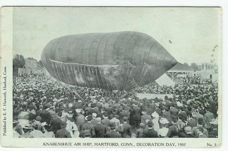
FOURTH postcard – Knabenshue Air Ship

Dirigible piloted by A. Roy Knabenshue in Hartford, Connecticut 1907

KNABENSHUE AIR SHIP, HARTFORD, CONN. DECORATION DAY, 1907

Obverse caption:  KNABENSHUE AIR SHIP, HARTFORD, CONN. DECORATION DAY, 1907

The airship – or dirigible – pictured on the obverse of this postcard was not an everyday fixture of the City of Hartford, Connecticut, but rather was a special feature brought in by its owner, Augustus Roy Knabenshue – aka Roy Knabenshue – just for the Decoration Day festival held in 1907.  The dirigible was powered by a small gasoline engine that drove a propeller, and A. Roy Knabenshue was able to pilot the lighter-than-air craft with amazing dexterity.  It’s a good thing that the airship would make a nearly vertical ascent, because it would be well-nigh impossible to navigate along the ground through the sea of hundreds, if not thousands, of eager onlookers.  Perhaps the Hartford fire department was on hand, ready with their combination car to aid Roy Knabenshue if his hydrogen-filled gas bag caught on fire.  The emergency crew should bring the life net to the scene, too, in case Mr. Knabenshue fell from the dizzying heights that his wonderful air-ship could take him.

Now here are the images of the backs of the postcards.  These are not presented in the same order as the fronts (above), since the first three postcards are all from the same sender (C. E. L., Jr.) to the same recipient (Miss Elsie Flansburg), and are presented in chronological order according to the postmark date.

*+*+* BEGIN LIFE NET REVERSE *+*+*

Life Net, Engine House No. 14, H. F. D., Hartford, Conn. - reverse

Life Net, Engine House No. 14, H. F. D., Hartford, Conn. - reverse

Life Net reverse (Postmarked May XX, 1910 10:00 AM from Elmwood, Connecticut):

Dear Elsie: I received your picture and thank you very much.  Charles E. and I are going to have some little pictures taken.  I will send you one of those and one of Dick and me when I get some finished.  Yours C. E. L., Jr.

Then at the top of the back of the postcard, C. E. L. has written: P. S. We play a game at Pope Park 1st diamond Sat. afternoon.

*+*+* END LIFE NET REVERSE *+*+*

*+*+* BEGIN COMBINATION CAR REVERSE *+*+*

Combination Car, Engine House No. 2, H. F. D., Hartford, Conn. - reverse

Combination Car, Engine House No. 2, H. F. D., Hartford, Conn. - reverse

Combination Car reverse (Postmarked June 2, 1910 6:00 PM from Elmwood, Connecticut):

Dear Elsie:  We won the game Sat. 11-12.  We came near getting beat but Chas. Elwood brought in the winning run.  If you come over to any of our games bring another girl because there is none that go from here.  The message is unsigned, but is evidently from C. E. L., Jr.

Then at the top of the back of the postcard: Come out before you go away. WLOL

 *+*+* END COMBINATION CAR REVERSE *+*+*

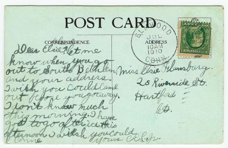
*+*+* BEGIN KNABENSHUE AIRSHIP REVERSE *+*+*

KNABENSHUE AIR SHIP, HARTFORD, CONN., DECORATION DAY, 1907

KNABENSHUE AIR SHIP, HARTFORD, CONN., DECORATION DAY, 1907

Roy Knabenshue airship reverse (Postmarked July 16, 1910 10:00 AM from Elmwood, Connecticut):

Dear Elsie, please let me know when you go out to South Bethlem. And your address.  I wish you could come out before you go away.  I don’t know much this morning.  I have got to go after ice this afternoon. I wish you could come.  Yours, CEL., Jr.

 *+*+* END KNABENSHUE AIRSHIP REVERSE *+*+*

*+*+* BEGIN HARTFORD POLICE STATION REVERSE *+*+*

Police Station, Hartford, Conn.

Police Station, Hartford, Conn.

Police Station, Hartford, Connecticut reverse (Postmarked June 23, 1910 9:00 PM from Hartford, Connecticut):

Hello old chap didn’t mean to make you wait so long.  Have been busy with the girls and got careless about writing.  Hope you are getting along good with the girls and don’t kiss them too much.  Please excuse writing awful bad pen ain’t got a cent to buy another.  Ans soon Ed. B.

*+*+* END HARTFORD POLICE STATION REVERSE *+*+*

These vintage postcards are presented as the entry in the Festival of Postcards 9th Edition: Locomotion.

The Difference of Night and Day

February 28, 2010

I have a few postcards in my collection that claim to depict a view at night.  But close examination of the supposed nighttime view almost always shows much brighter detail than would have been visible if the view had been originally photographed after the sun had set.  So, there must be a different way to depict a night scene than starting with an original photograph that had actually been taken after dark.  What I discovered is that at least some — and probably most if not all — of pre-photochrome night time postcards really show a daytime view that has been altered to make it appear to be a nighttime scene!  I have chosen two linen-era[1] postcards to demonstrate my thesis.  Shown below is “AUDITORIUM AND CONVENTION HALL BY NIGHT, ATLANTIC CITY, N. J. — 5“.[2]  

The eye is immediately drawn to the spectacular shafts of colored light emanating from spotlights mounted atop the front facade of the auditorium:  Three yellow spotlights, two red and two blue lights, and one central purple spotlight.  The windows of the auditorium and the surrounding buildings are aglow with yellow light, and a large sign on the right side of the auditorium proclaims GOLF in bright red letters, apparently illuminated from within.  The right side of the auditorium is adorned with ten flags:  A United States flag at each corner, with varicolored pennant flags in between.  The beach in front of the auditorium is dotted with people, right up to the seashore, and a multitude of people are wading and swimming in the ocean, enjoying the waves and water.  A not implausible scene, taken as a whole, but, on reflection, the beach — and especially the water — would most likely be almost bereft of people after dark, even at such a popular vacation spot as Atlantic City, New Jersey.  Still, in lieu of evidence to the contrary, we can hypothesize that this postcard view of the auditorium truly is based on a photograph that was taken at night.   

AUDITORIUM AND CONVENTION HALL BY NIGHT, ATLANTIC CITY, N. J. -- Reverse

AUDITORIUM AND CONVENTION HALL BY NIGHT, ATLANTIC CITY, N. J. -- Reverse


AUDITORIUM AND CONVENTION HALL BY NIGHT, ATLANTIC CITY, N. J. -- Obverse

AUDITORIUM AND CONVENTION HALL BY NIGHT, ATLANTIC CITY, N. J. -- Obverse

 Matched set of postcards: NIGHT – Above   |||   DAY – Below


ATLANTIC CITY AUDITORIUM AND CONVENTION HALL, ATLANTIC CITY, N.. J -- Obverse

ATLANTIC CITY AUDITORIUM AND CONVENTION HALL, ATLANTIC CITY, N.. J -- Obverse


ATLANTIC CITY AUDITORIUM AND CONVENTION HALL, ATLANTIC CITY, N.. J -- Reverse
ATLANTIC CITY AUDITORIUM AND CONVENTION HALL, ATLANTIC CITY, N.. J — Reverse

Now consider the above postcard.  Obverse top caption: “9  ATLANTIC CITY AUDITORIUM AND CONVENTION HALL, ATLANTIC CITY, N.. J.”  Obverse bottom caption: “LARGEST CONVENTION HALL IN THE WORLD, SEATING CAPACITY 40,000, BALL ROOM 5,000”  

Close examination reveals that both this daytime view as well as the nighttime view are based on the same photographic original!  Note especially the identical pattern of the breaking waves as they approach the shore.  The most telling piece of evidence, however,  is that the distribution of people both on the beach and in the water is exactly the same in both the daytime and nighttime postcard views!  

There are some minor differences between the two postcards.  The GOLF sign lighted in red in the night view is completely absent in the day view, and the day view shows the American flag flying at the top of each of the ten flagpoles along the right side of the auditorium, whereas the night view has pennant flags in the second through ninth positions.  How can this be?  Most of us are familiar with the magic that can be accomplished with PhotoShop and other software programs that can be used to alter a digital photograph in ways both major and minor.  Well, the photographers and printers of years gone by had similar techniques at their disposal, albeit in analog form.  The GOLF sign actually existed in the day view; it has simply been removed to better show off the architectural lines of the auditorium.  In the day view, a very close examination of the portion of the side of the auditorium that was obstructed by the GOLF sign shows a slightly lighter building color with the same outline as the GOLF sign.  

As for the flags, it is probable that the original photograph upon which both views are based showed flags atop the flagpoles, but it is highly unlikely that all of the flags would have been flying straight out at the moment the photo was taken.  Thus, all of the flags in both the day view and the night view almost certainly have been manually added.  American flags are more impressive in the day view, and the replacement of eight of the American flags with pennants gives the night view more splashes of color.  It is also possible that the auditorium had no flags at all, and that the flags – flagpoles and all – were added to the postcard view to supply more visual interest.  One would have to reference contemporary real photo images of the auditorium to verify.  Keep in mind that until the advent of the photochrome postcard, all view postcards were either printed in black and white, or black and white that was colorized.  The selection and placement of color was under the complete control of the printer, as was the design, even when the design was based on a photographic original.  I intend to explore the altering of postcard images in an upcoming post.  Suffice it to say for now, when it comes to a postcard view, you can’t always believe what you see!  

Some postcards are more amenable to a nighttime version than others.  Postcards that lend themselves to a night view are ones that would typically have light or illuminated elements after dark.  Postcards that depict a skyline or an areal (sometimes called a bird’s eye) view can show all of the windows in the buildings lit up in the night version.  Views of ships often work well in an “at night” version, since they were often equipped with one or more searchlights, to which the color artist would add a shaft of white light.  Too, light would be shown emanating from each of the windows or portholes of the ship.  Postcard views of lighthouses also lend themselves well to both nighttime and daytime editions.  

Just one more observation concerning vintage postcard night views.  Many of the night scenes that do not have an obvious terrestrial light source (and even some that do) will show a full moon in the sky, which would lead the viewer of the postcard to assume that the light of the full moon was the light source for the night scene.  Nope!  The postcard was almost certainly based on a photograph that had been taken in bright sunlight, with the sky that had been colored light blue in the daytime view version of the postcard replaced with a dark blue-black color for the nighttime version.  Then, the creation of a full moon was one of the easiest tricks up the postcard color artist’s metaphorical sleeve:  Simply leave a circular area in the dark sky without any color!  A full moon in the night sky on an older view postcard is almost a dead giveaway that the view is really a daytime view that has been turned into a faux night view.  

To the best of my knowledge, the Atlantic City Auditorium is the only day-and-night matched set in my collection, but I do own one half of two other sets.

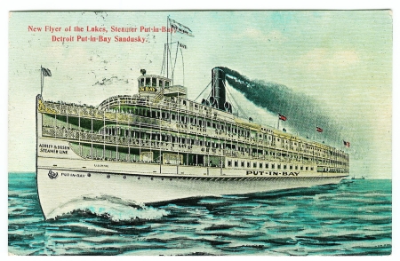
I have the daytime version of “New Flyer of the Lakes, Steamer Put-in-Bay, Detroit Put-in-Bay Sandusky” (a Lake Erie steamer):

New Flyer of the Lakes__Put-in-Bay__DAY__obverse

New Flyer of the Lakes__Put-in-Bay__DAY__obverse

New Flyer of the Lakes__Put-in-Bay__DAY__reverse

New Flyer of the Lakes__Put-in-Bay__DAY__reverse

Its nighttime counterpart is listed on eBay as ”Antique POSTCARD “New Flyer of the Lakes” Ship, Detroit”.  This eBay seller uses photo hosting by Auctiva, so you can click on the front image in the item description to see an enlarged view.  Close examination of the night view will show that it is merely the day view printed with a different palette of colors.  Note especially that the wave pattern is identical in both printings.  A shaft of white has been added to the searchlight anchored above the captain’s bridge, the windows of the ship have been printed with yellow ink, and the nearly obligatory full moon has been added to the sky.

Here is the nighttime version of “Birds Eye View of Albany N. Y.”:

Birds Eye View of Albany N. Y.__NIGHT__obverse

Birds Eye View of Albany N. Y.__NIGHT__obverse

Birds Eye View of Albany N. Y.__NIGHT__reverse

Birds Eye View of Albany N. Y.__NIGHT__reverse

Its daytime counterpart, titled Lower Portion of Albany, New York 1910, is posted in the “Albany, New York Postcards & Old Photos” area of familyoldphotos.com.  Note that the designer-printer of the night version has not only drawn in a full moon, but also has drawn a star-studded sky over the skyline of Albany.  It may be hard to see in the image provided above, but the stars have been drawn with points, just like the star that tops a Christmas tree!  Also, the artist must have known at least a little about constellations, since there is a star pattern on the right that approximates the Big Dipper (Ursa Major).  Also, the star cluster located beneath the full moon could be a representation of the Pleiades (“The Seven Sisters”).  Although I’m sure that the artist was striving for an overall pleasing effect that would sell more postcards rather than for astronomical accuracy, whether by accident or design, the star cluster is drawn showing six stars, the seventh star being much fainter than the other six when viewing the Pleiades with the naked eye.

With a bit of patience and diligent searching, a postcard collector could acquire a number of day-and-night matched sets such as the above examples, which would make an unusual and informative display at a local library, museum or postcard show.  Also, such a collection could form the basis for an interesting lecture presentation at a postcard club meeting.  I would like to know of other day-and-night matched sets that you may find!  

So, what is the difference between night and day?  When it comes to vintage postcards, the only difference is the color of the ink!  However, when it comes to music, perhaps this composition by Indiana’s own Cole Porter explains the difference (note the faux full moon backdrop in the final video footage of this YouTube video):

As we close this exploration of night and day scenes on old postcards, if we have gained a little knowledge, we can truly proclaim, “I’m beginning to see the light!”  Or, we can sing along with Ella Fitzgerald (with Duke Ellington and his orchestra):

This post is being submitted to the Festival of Postcards, coordinated by Evelyn Yvonne Theriault, since the theme of this Festival (7th Edition) is “Light.”  Please do view the dazzling array of entries at A Festival of Postcards (7th Ed.) – Light | A Canadian Family!

Designated trademarks and brands are the property of their respective owners.

  Notes  

  1. ^ Both of these linen era postcards are unused, so cannot be dated using a postmark date, but the daytime view is printed by Curt Teich and Company, Chicago, Illinois, and so can be dated to 1933 by the postcard number 3A-H1235.  The “3A” indicates the 3 year of the 1930s.  I have not found a way to date the unused nighttime postcard, published by the E. C. Kropp Company, Milwaukee, Wisconsin, based on identification marks on the card (31465 at the top middle area of the address side of the reverse and EJY at the bottom of the dividing line text on the reverse), but if anyone knows of a guide to dating E. C. Kropp postcards, please let me know.  In any case, the fact that the nighttime card has a linen finish (on both sides) and has explanatory text on the reverse is consistent with a printing date in the mid-to-late 1930s, roughly contemporaneous with the daytime card.
  2. ^ The reverse of the card has further commentary: “The Convention Hall, possibly the largest in the world, covers seven acres of ground and can seat the entire permanent population of Atlantic City at one time, with room to spare. The main Auditorium is used for exhibition purposes, ice-skating carnivals, and even made into a full-sized football field.”


U. S. Postal Card Club

December 13, 2009
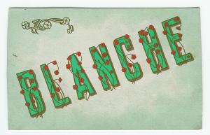
U. S. Postal Card Club postcard - Blanche

Obverse of BLANCHE in the U. S. Postal Card Club series

This is one of those postcards that is more interesting for its reverse (address/correspondence side) than for its obverse (picture side).  The obverse simply has the name Blanche in all capital letters, printed diagonally with a positive slope.  Each letter is solid green with a gold border and a brown shadow effect, and is decorated with a gold floral pattern sporting four-petaled red blossoms.  The background has a light green border that fades to white toward the center, and sports a gold floral accent in the upper-left corner that matches the design on the letters (sans the red coloration of the blossom petals).

Blanche, besides being a woman’s name, is also the French spelling of the word white.  Blanche was a more popular name around the turn of the twentieth century than it is at the present time, according to the chart on quickbabynames.com, dropping in popularity from around 0.5% of all births in the 1880s to under 0.005% of all births in the 1960s and succeeding decades.  If you are named Blanche and attending a large party, and somebody yells across the room, “Hi, Blanche!” the chances are pretty good that they are talking to you!

The reverse of this “Blanche” postcard has the following advertisement printed in black ink: 

NOTICE–The holder of this card is a MEMBER
of the U. S. P. C. Club, and is entitled to membership prices.
On receipt of 10c  Coin) we will mail you 8 of these up-to-date postal cards.
     Make your selection from the following list:   ORDER TODAY 

Love         Leave For      My Pet      How R. U.        Farewell
Stung       Will C. U.      Regards    Y. Don’t U.       Au Revoir
I love U.    Kisses          My Darling     U  R. E. Z.   Good Luck
Dream of Me                 Will U. Go        Kisses—Lovers Sweets
My Sweetheart              Best Wishes    Silence Gives Consent
I’m Waiting for You        Please Write    Better late than never
Congratulate U All         Will U Come      Birthday Greetings
Will Write U. From        Father’s Baby    Having a good time
I dream of thee             Sweet dreams    Many happy returns
Will U. B. Mine            My Honey Boy       With fond hope
Love me and I’m thine   We R All Well        Yours forever
Make money honest, but make it           Also all Popular Names. 

U. S. Postal Card Club, Williamson Bldg, Cleveland, O.
——————————————————————————-
For correspondence 

U. S. Postal Card Club postcard - Blanche

Reverse of BLANCHE in the U. S. Postal Card Club series

Some of the messages that a member of the Club could order are incredibly similar to typical 21st century text messages, especially in regards to the use of abbreviations!  The advertisement for the U. S. Postal Card Club takes up nearly half of the space usually allotted for the sender to write a message, so the printer added a solid line under the last line of the ad, with “For correspondence.” printed underneath the line.  It is apparent that the postcard would normally be printed without the advertisement, since the reverse of the card is printed in brown ink, whereas the ad is printed in black ink.  Another indication that the ad is an addition to the regular printed reverse is the presence of “For correspondence” [partially trimmed] — printed in brown ink — in the very upper left corner of the card, indicating that a postcard without the ad would have had the entire left side of the reverse available for a message. 

Many divided-back postcards have a vertical line separating the left side (message side) from the right side (address side).  However, some publishers use the vertical separator to print company or other pertinent information, and this postcard falls into the latter category.  If the card is rotated 90 degrees counter-clockwise, the text of the separator can be easily read: 

System Patent Pending.  Levaur Lithograph Post Card Co., Cleveland, O. 

The following text is inside the stamp box, which is delineated by dotted lines: 

Place Stamp
       Here 

     Domestic
 Canada, Cuba
Mexico,Hawaii
   Philippines
    Porto Rico
      1 Cent 

      Foreign
      2 Cents 

The remaining printing on the reverse consists of “POST CARD”  in a large bold sans-serif font and “This side for Address” underneath it, both being located to the left of the stamp box.  There are also four dotted lines on the address side of the reverse on which to pen the address of the intended recipient.  The last tidbit of printing is “No. 42”, located just above and to the right of the separator text.  That number makes at least some sort of sense, since there are forty obverse messsages listed in the ad, not including  “Also all Popular Names.” , to which the finger is pointing.  One can speculate that the obverse messages that a member of the Club could order might have been numbered 1 through 40, with perhaps mens’ names being No. 41 and womens’ names being No. 42.  Just a conjecture; input from readers is welcome! 

You might have noticed that the postcard is not perfectly rectangular.  This is because the top and both sides have been cut by the sender.  This postcard was enclosed in an envelope when mailed to the (unknown) recipient.  The proof that the postcard was mailed within an envelope is the presence of a faint embossed circle exactly the size of a postal mark on the obverse underneath the N of BLANCHE.  The circle is only faintly embossed; however, its presence can be tactilly detected as well as visually, but to be visible, the postcard must be held such that light reflects off of the obverse at just the right angle to reveal the blind-stamped postmark as a shiny circle.  The circle is shiny because its ever-so-slightly raised surface is more susceptible to rubbing than the rest of the matt surface of the obverse.  Apparently, postcards were inexpensive enough “back in the day” that they were sometimes used as stationery.  It might be fun to see if any of the postcards in your collection have this telltale sign of having been mailed under cover.  (A “cover” is a fancy term for an envelope that has been mailed, since the envelope covers the letter.)  My conjecture is that this postcard was trimmed by the sender so that it would fit in the envelope in which it was mailed. 

The sender, using a fountain pen with black ink, has written the following message: 

I, am sendïng Pa a lovely card to-day.  I, am sorry poor Carrie ïs gone.  And a hard horse master, Clark knows him well for he keeps him in Hay. 

This leaves Violet in Bed with a bad sore-throat & taking 3 kinds of medicine.  Hope Evelyne wïll soon be better.  I, am making the Girls light blue silk dresses for X’mas night to speak in.  Grace. 

Grace is most likely of German extraction, since she uses the umlaut diacritical mark over the letter “i” three times.  Her reference to Christmas indicates that the message was probably written in late November or in the month of December before the 25th.  However, the year the message was written remains a mystery, although it is very likely to have been written between 1907 and 1917.  This time frame is based on these parameters:  Divided back postcard, one cent domestic postage, and lack of white border around the obverse. 

Would anyone care to hazard a guess as to whether Grace was left- or right-handed? 

The Williamson Building, which the U. S. Postal Card Club called its home, was born with the 1900s, having been started in April, 1899 and completed one year later.  It was 17 stories tall, and was the headquarters of the Federal Reserve Bank of Cleveland, among other prestigious tenants, per the Encyclopedia of Cleveland History (link will open in a new window). <Begin funny thought>  A person having business for the first time with the Federal Reserve Bank of Cleveland inquires at the front desk of the Williamson Building for its location.  The receptionist replies:  “The Federal Reserve Bank of Cleveland?  It is located on the fifth floor, just down the hall from the U. S. Postal Card Club.” <End funny thought>   The Williamson Building was sited on Public Square in the heart of downtown Cleveland, Ohio, and is called “the monumental gateway to Euclid Avenue” by the encyclopedia cited above.  The building was demolished in 1982, but there are undoubtedly many postcard views that picture it. 

The most intriguing aspect of this postcard is the U. S. Postal Card Club.  I could find NO online information about this club, nor any info about the Levaur Lithographic Post Card Company publisher.  Any information on the Levaur Lithographic Post Card Company and the U. S. Postal Card Club would be most welcome.  Also, it might be fun as well as instructive to browse through your collection for postcards bearing any of the forty obverse messages that were available from the Club! 

This BLANCHE postcard is being submitted to the Festival of Postcards, coordinated by Evelyn Yvonne Theriault, since the theme of this Festival is “white.”  Please do view the dazzling array of entries at Festival of Postcards (6th Ed.) – White!