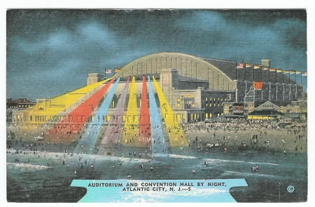
I have a few postcards in my collection that claim to depict a view at night. But close examination of the supposed nighttime view almost always shows much brighter detail than would have been visible if the view had been originally photographed after the sun had set. So, there must be a different way to depict a night scene than starting with an original photograph that had actually been taken after dark. What I discovered is that at least some — and probably most if not all — of pre-photochrome night time postcards really show a daytime view that has been altered to make it appear to be a nighttime scene! I have chosen two linen-era[1] postcards to demonstrate my thesis. Shown below is “AUDITORIUM AND CONVENTION HALL BY NIGHT, ATLANTIC CITY, N. J. — 5“.[2]
The eye is immediately drawn to the spectacular shafts of colored light emanating from spotlights mounted atop the front facade of the auditorium: Three yellow spotlights, two red and two blue lights, and one central purple spotlight. The windows of the auditorium and the surrounding buildings are aglow with yellow light, and a large sign on the right side of the auditorium proclaims GOLF in bright red letters, apparently illuminated from within. The right side of the auditorium is adorned with ten flags: A United States flag at each corner, with varicolored pennant flags in between. The beach in front of the auditorium is dotted with people, right up to the seashore, and a multitude of people are wading and swimming in the ocean, enjoying the waves and water. A not implausible scene, taken as a whole, but, on reflection, the beach — and especially the water — would most likely be almost bereft of people after dark, even at such a popular vacation spot as Atlantic City, New Jersey. Still, in lieu of evidence to the contrary, we can hypothesize that this postcard view of the auditorium truly is based on a photograph that was taken at night.
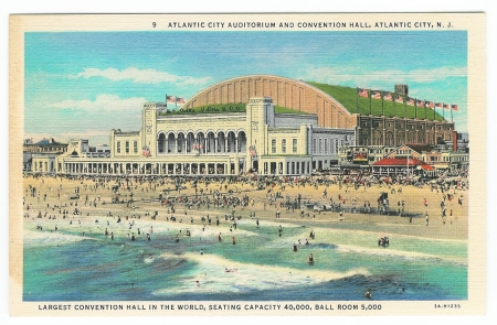
Now consider the above postcard. Obverse top caption: “9 ATLANTIC CITY AUDITORIUM AND CONVENTION HALL, ATLANTIC CITY, N.. J.” Obverse bottom caption: “LARGEST CONVENTION HALL IN THE WORLD, SEATING CAPACITY 40,000, BALL ROOM 5,000”
Close examination reveals that both this daytime view as well as the nighttime view are based on the same photographic original! Note especially the identical pattern of the breaking waves as they approach the shore. The most telling piece of evidence, however, is that the distribution of people both on the beach and in the water is exactly the same in both the daytime and nighttime postcard views!
There are some minor differences between the two postcards. The GOLF sign lighted in red in the night view is completely absent in the day view, and the day view shows the American flag flying at the top of each of the ten flagpoles along the right side of the auditorium, whereas the night view has pennant flags in the second through ninth positions. How can this be? Most of us are familiar with the magic that can be accomplished with PhotoShop and other software programs that can be used to alter a digital photograph in ways both major and minor. Well, the photographers and printers of years gone by had similar techniques at their disposal, albeit in analog form. The GOLF sign actually existed in the day view; it has simply been removed to better show off the architectural lines of the auditorium. In the day view, a very close examination of the portion of the side of the auditorium that was obstructed by the GOLF sign shows a slightly lighter building color with the same outline as the GOLF sign.
As for the flags, it is probable that the original photograph upon which both views are based showed flags atop the flagpoles, but it is highly unlikely that all of the flags would have been flying straight out at the moment the photo was taken. Thus, all of the flags in both the day view and the night view almost certainly have been manually added. American flags are more impressive in the day view, and the replacement of eight of the American flags with pennants gives the night view more splashes of color. It is also possible that the auditorium had no flags at all, and that the flags – flagpoles and all – were added to the postcard view to supply more visual interest. One would have to reference contemporary real photo images of the auditorium to verify. Keep in mind that until the advent of the photochrome postcard, all view postcards were either printed in black and white, or black and white that was colorized. The selection and placement of color was under the complete control of the printer, as was the design, even when the design was based on a photographic original. I intend to explore the altering of postcard images in an upcoming post. Suffice it to say for now, when it comes to a postcard view, you can’t always believe what you see!
Some postcards are more amenable to a nighttime version than others. Postcards that lend themselves to a night view are ones that would typically have light or illuminated elements after dark. Postcards that depict a skyline or an areal (sometimes called a bird’s eye) view can show all of the windows in the buildings lit up in the night version. Views of ships often work well in an “at night” version, since they were often equipped with one or more searchlights, to which the color artist would add a shaft of white light. Too, light would be shown emanating from each of the windows or portholes of the ship. Postcard views of lighthouses also lend themselves well to both nighttime and daytime editions.
Just one more observation concerning vintage postcard night views. Many of the night scenes that do not have an obvious terrestrial light source (and even some that do) will show a full moon in the sky, which would lead the viewer of the postcard to assume that the light of the full moon was the light source for the night scene. Nope! The postcard was almost certainly based on a photograph that had been taken in bright sunlight, with the sky that had been colored light blue in the daytime view version of the postcard replaced with a dark blue-black color for the nighttime version. Then, the creation of a full moon was one of the easiest tricks up the postcard color artist’s metaphorical sleeve: Simply leave a circular area in the dark sky without any color! A full moon in the night sky on an older view postcard is almost a dead giveaway that the view is really a daytime view that has been turned into a faux night view.
To the best of my knowledge, the Atlantic City Auditorium is the only day-and-night matched set in my collection, but I do own one half of two other sets.
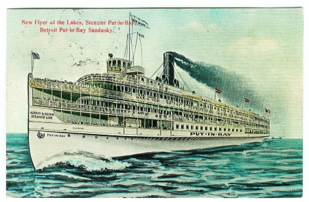
I have the daytime version of “New Flyer of the Lakes, Steamer Put-in-Bay, Detroit Put-in-Bay Sandusky” (a Lake Erie steamer):
Its nighttime counterpart is listed on eBay as ”Antique POSTCARD “New Flyer of the Lakes” Ship, Detroit”. This eBay seller uses photo hosting by Auctiva, so you can click on the front image in the item description to see an enlarged view. Close examination of the night view will show that it is merely the day view printed with a different palette of colors. Note especially that the wave pattern is identical in both printings. A shaft of white has been added to the searchlight anchored above the captain’s bridge, the windows of the ship have been printed with yellow ink, and the nearly obligatory full moon has been added to the sky.
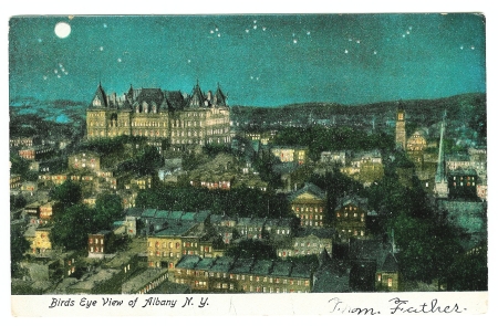
Here is the nighttime version of “Birds Eye View of Albany N. Y.”:
Its daytime counterpart, titled Lower Portion of Albany, New York 1910, is posted in the “Albany, New York Postcards & Old Photos” area of familyoldphotos.com. Note that the designer-printer of the night version has not only drawn in a full moon, but also has drawn a star-studded sky over the skyline of Albany. It may be hard to see in the image provided above, but the stars have been drawn with points, just like the star that tops a Christmas tree! Also, the artist must have known at least a little about constellations, since there is a star pattern on the right that approximates the Big Dipper (Ursa Major). Also, the star cluster located beneath the full moon could be a representation of the Pleiades (“The Seven Sisters”). Although I’m sure that the artist was striving for an overall pleasing effect that would sell more postcards rather than for astronomical accuracy, whether by accident or design, the star cluster is drawn showing six stars, the seventh star being much fainter than the other six when viewing the Pleiades with the naked eye.
With a bit of patience and diligent searching, a postcard collector could acquire a number of day-and-night matched sets such as the above examples, which would make an unusual and informative display at a local library, museum or postcard show. Also, such a collection could form the basis for an interesting lecture presentation at a postcard club meeting. I would like to know of other day-and-night matched sets that you may find!
So, what is the difference between night and day? When it comes to vintage postcards, the only difference is the color of the ink! However, when it comes to music, perhaps this composition by Indiana’s own Cole Porter explains the difference (note the faux full moon backdrop in the final video footage of this YouTube video):
As we close this exploration of night and day scenes on old postcards, if we have gained a little knowledge, we can truly proclaim, “I’m beginning to see the light!” Or, we can sing along with Ella Fitzgerald (with Duke Ellington and his orchestra):
This post is being submitted to the Festival of Postcards, coordinated by Evelyn Yvonne Theriault, since the theme of this Festival (7th Edition) is “Light.” Please do view the dazzling array of entries at A Festival of Postcards (7th Ed.) – Light | A Canadian Family!
Designated trademarks and brands are the property of their respective owners.
Notes
- ^ Both of these linen era postcards are unused, so cannot be dated using a postmark date, but the daytime view is printed by Curt Teich and Company, Chicago, Illinois, and so can be dated to 1933 by the postcard number 3A-H1235. The “3A” indicates the 3 year of the 1930s. I have not found a way to date the unused nighttime postcard, published by the E. C. Kropp Company, Milwaukee, Wisconsin, based on identification marks on the card (31465 at the top middle area of the address side of the reverse and EJY at the bottom of the dividing line text on the reverse), but if anyone knows of a guide to dating E. C. Kropp postcards, please let me know. In any case, the fact that the nighttime card has a linen finish (on both sides) and has explanatory text on the reverse is consistent with a printing date in the mid-to-late 1930s, roughly contemporaneous with the daytime card.
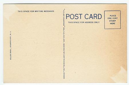
- ^ The reverse of the card has further commentary: “The Convention Hall, possibly the largest in the world, covers seven acres of ground and can seat the entire permanent population of Atlantic City at one time, with room to spare. The main Auditorium is used for exhibition purposes, ice-skating carnivals, and even made into a full-sized football field.”

