The fashion in shoes one hundred years ago was quite different from the footwear designs of the twenty-first century, yet at least one shoe manufacturer, the George E. Keith Company, was as eager to use one of the most popular media of the early nineteen hundreds — the picture postcard — for advertising purposes as shoe companies of the two thousands are to use the world wide web as an advertising vehicle. Presented here are four vintage postcards that advertise Walk-Over shoes for women:
*+*+*+* BEGIN POSTCARD 1 *+*+*+*
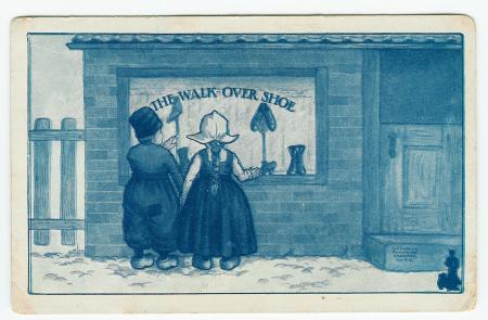
Walk-Over shoes postcard 1 — The advertising slogan on the reverse reads: They’re as stylish as comfortable and as durable as they are stylish–Walk-Over shoes
*+*+*+* END POSTCARD 1 *+*+*+*
*+*+*+* BEGIN POSTCARD 2 *+*+*+*
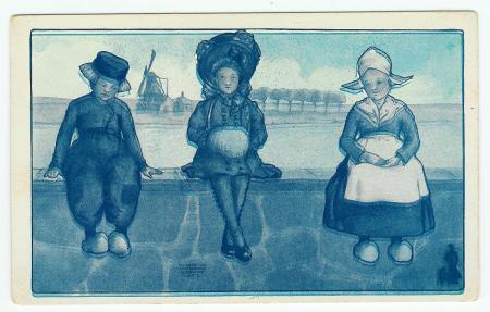
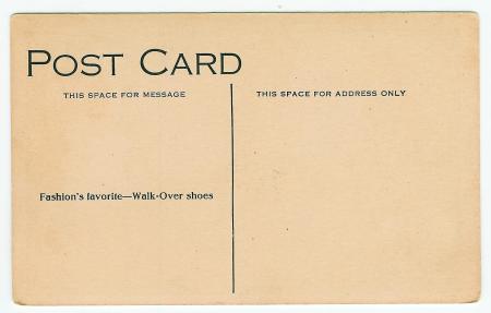
Walk-Over shoes postcard 2 — The advertising slogan on the reverse reads: Fashion’s favorite–Walk-Over shoes
*+*+*+* END POSTCARD 2 *+*+*+*
*+*+*+* BEGIN POSTCARD 3 *+*+*+*
Walk-Over shoes postcard 3 — The advertising slogan on the reverse reads: Fair weather friends and stormy day comrades–Walk-Over shoes
*+*+*+* END POSTCARD 3 *+*+*+*
*+*+*+* BEGIN POSTCARD 4 *+*+*+*
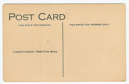
Walk-Over shoes postcard 4 — The advertising slogan on the reverse reads: Comfort’s choice–Walk-Over shoes
*+*+*+* END POSTCARD 4 *+*+*+*
Here is a detail-image of the Walk-Over shoes for women logo that appears in the lower right corner of the obverse (front) side of each postcard:
The printing quality of these post cards is quite low, but you can get a much better idea of the Walk-Over shoe for women logo by looking at the second image at the WALK-OVER SHOES blog posted by Vintage123. That post consists mainly of images of a vintage Walk-Over shoes catalog published by the manufacturer. The catalog is undated, but from the looks of the shoes displayed in the catalogue, the era is probably right in the 1907-1908-1909-1910-1911-1912-1913 era. The logo consists of a wasp-waist woman walking over an oversized Walk-Over shoe with a confident stride. The slogan or motto of the Walk-Over shoe is “The Sign of Satisfaction”. The illustration goes on to proclaim “Walk-Over Fashions”, and gives the location of the shoe manufacturer as: The WALK-OVER Plant, Campello, Brockton, Mass, U. S. A.
Here is a link to a fascinating history of the Keith family who settled in the the vicinity of Bridgewater, Massachusetts, including Brockton, Massachusetts and the neighborhood on the south side of Brockton, Campello. Note especially entry (VIII) for GEORGE ELDON KEITH, who is the Geo. E. Keith of the George E. Keith Company, Inc. This snippet from his biography is as much food for thought today as it was when written in 1912: “Whether the elements of success in life are innate attributes of the individual, or whether they are quickened by a process of circumstantial development, it is impossible to determine clearly; yet the study of a successful life is none the less interesting and profitable by reason of the existence of this same uncertainty. So much in excess of successes is the record of failures that one is constrained to attempt an analysis in either case, and to determine the method of causation in an approximate way. The march of improvement and progress is accelerated day by day, and each moment seems to demand a man of broader intelligence and greater discernment than did the preceding one. Successful men must be live men in this age, bristling with activity; and the lessons of personal history may be far-reaching to an extent not superficially evident.”
Each of these postcards is what is termed an “artist signed” postcard. This does not mean that the postcard contains the handwritten signature of the artist/designer of the postcard image. In fact, not even the printed signature of the artist. The term artist signed is applied to any postcard that has the attribution of the artist printed on the postcard, usually on the image (front) side. On the front of each postcard is printed (in small font): “KATHARINE MAYNADIER BROWNE 1909”, but printed using four lines, thus:
KATHARINE
MAYNADIER
BROWNE
1909
Using web-based research, I discovered that Katharine Maynadier Browne was the illustrator of the 1909 childrens’ book (with 84 pages): Little Stories About Little Animals for Little Children by Susan Holton, published in Boston by Leroy Phillips. According to a listing on the website of Carpe Diem Fine Books, Katharine Maynadier Browne also was the designer of the decorative endpapers for the book Madame Angora, a later printing of the 1901 book by Harriet A. Cheever. The endpapers by Browne are dated 1910. This book was published by Dana Estes, also of Boston, Massachusetts. Perhaps oddly, Katharine did not also supply the illustrations in the book. That may be a good thing, though, since, according to the Carpe Diem listing, the illustrations are by Jo J. Mora. Apparently, bibliophiles cotton to books illustrated by Jo Mora, whereas Katharine M. Browne exists in relative obscurity. I deduce from her supplying artwork for two books printed in Boston in the 1910 era, that Katharine was a Boston-area artist/illustrator who received a commission to create a series of picture postcards for the George E. Keith Company. Note that the postcard images themselves are not particularly footwear-centric, except postcard number 1, which shows Walk-Over shoes in a store window display. Also, postcard number 2 shows an American girl wearing shiny leather shoes, perhaps patent leather shoes, sitting on a dike between a Dutch boy and a Dutch girl. In fact, all of the other persons illustrated on the postcards are Dutch, and shown wearing wooden shoes. Of all of the kinds of shoes that were manufactured by the George E. Keith Company, I have found no references that cite the production of wooden shoes! What can explain the presence of wooden shoes on postcards meant to entice people to buy leather WalkOver shoes? Well, almost anything Dutch was wildly popular during the golden age of postcards, so the presence of the Dutch scenes (windmills, Dutch doors, dikes, wooden shoes) helped ensure that the postcard series would be a good seller. I use the term “series” loosely, because although the four postcards presented here were obviously printed on or around the year of the illustration copyright (1909), the postcards are not numbered or sequenced in any way. The numbering scheme for the postcard images above is simply the order of presentation or appearance in this blog. There are many more vintage postcards in this series, some that were copyright 1909 such as the ones presented here, and others that were in a nearly-identical (in theme, not in illustration) series published (or at least with illustrations copyrighted) the next year, 1910.
I solicit comments from anyone who has more information on this enigmatic artist/illustrator, Katharine Maynadier Browne, who seems to have appeared on the art scene in the Boston area in 1909, and then dropped below the radar after 1910. Does anybody have any earlier or later examples of Katharine’s artwork?
This post is part of a ‘Festival of dollparts: October 13th – 26th’, in support of our friend Michelle’s dollparts Kickstarter campaign. The theme is any kind of old paper and ephemera about apparel and fashion. Read her Kickstarter profile page :: here :: and throw in $1 or more for a very worthy fashion project. Any other bloggers, feel free to dig for mercantile magic flatstuffs and join the festival.
waspwaistwoman
